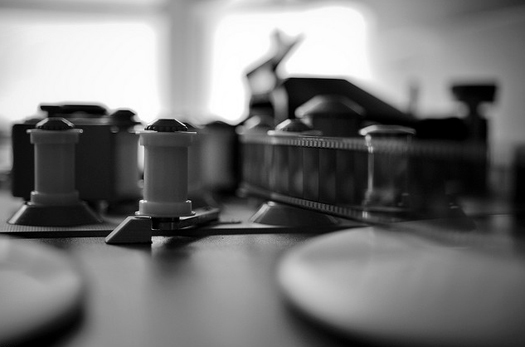
A steenbeck editor. Photo by Brian Krijgsman
To be a top-notch film editor you need to have the eye of a painter, the ear of a composer and the story sense of a writer. You also need the ruthlessness of a commodities trader. What can designers, architects and writers learn from the art of film editing?
A number of years ago, while living in London, I worked for a company that made documentaries for the BBC. It was during the waning days of shooting on 16mm film; video was on the ascent. Digital software such as Avid and Lightworks were emerging and old style film editing was giving way to ones and zeros. This was not necessarily a bad thing — non-linear digital editing enhances speed and flexibility — but it also diminishes craft and what I can only call culture.
The office where I worked occupied the top floor of a converted wharf that overlooked the river Thames — Eames office chairs, angle poise lamps, Le Corbusier sofas. Large windows framed views of river and sky. The office was open and bright.
The editing room was different. It was small and dark and its interior was shrouded with drapes. An immense flatbed Steenbeck editing machine with two hooded monitors took up one wall. Grey metal reels of film were stacked against another. Diagrams were taped wherever extra space was available. Strips of film hung like laundry over bins on casters.
At nine in the morning the editor and his assistant would enter the room ceremoniously carrying mugs of tea. The director would enter about an hour later, stay through lunch (often brought in by the assistant) and depart around four to make phone calls, work on the script or meet with producers.
At eight in the evening, when the office had emptied, the assistant would dart out and return with bottles of beer. Only then would the editor crack open the door. If I was lucky, he would call me in and I would stand in the dark as he ran through the footage of his day’s work.
The film hissed as it sped through the Steenbeck’s complicated system of reels and relays. The dialogue — without levels, music or fades — crackled through small speakers. Images flickered. The editor would lean back and watch the rough cut while he jotted down notes, made technical talk with his assistant and knocked back the beers.
The first thing I learned was that an editor does much more than splice film. They make thousands of decisions throughout the day as they carve out a path through a thicket of material. For every cut there are perhaps twenty other cuts that could be made. For every yes there are at least twenty nos.
If a scene wasn’t working, the editor would physically undo a splice, chose a different strip of film, and splice it back together. As a result the story would incrementally change course, subtly influencing everything that had come before as well as the footage that would come later. Miniscule changes could have immense implications.
Editing, like stringing sentences together, or working through a design, is not the rational problem-solving procedure we often pretend it to be. It’s more like a process of discovery where skill and chance work together. The skill of an editor is to be confident enough to allow for chance to indicate where the next cut should go, and then to be adept enough to follow that path. In a similar way novelists talk about characters taking over a story or graphic designers describe how ratios between type and form feel right. If the editor is really working in sync with his material he doesn’t assemble the film, the film assembles him. Do some buildings build themselves?
One evening the editor was screening a rough cut of a film about the use of unclaimed urban lots in London. An old man was recalling planting a Victory Garden during World War II. As he talked he was tenderly tending a row of runner beans. His face filled most of the frame. The sun was setting behind him; it was a lovely scene. The editor abruptly stopped the film.
“Did you see that?” he asked.
I hadn’t seen anything.
“See how it jumps there?”
Only then did I notice that there was a visual stutter.
“That’s a jump cut. I should have caught that sooner.”
“Jump cut?”
“The cameraman changed shot size but not enough. I made a cut there, and shortened the man’s sentence. But the second shot is too near in size to the first. It’s not large enough of a shift. The eye trips on the cut.”
“I don’t understand.” I said.
The editor undid the spice and chose some different strips of film. In the new sequence the old man was still tending the runner beans but when he reached the part of the sentence that the editor wanted to shorten, he now cut to a wider master shot that took in the surrounding buildings and more sky. The editor then laid the sound track under both shots and “glued” the whole together. Weirdly the eye could handle this more dramatic cut easier then the smaller, more subtle one. The visual brain seems to respond better to quick and dramatic changes of scale than subtle shifts within the same visual field.
Watching the editor also taught me the value of simplicity. If the editor thought that a scene wasn’t working the first thing he did was to eliminate. Less cuts, less overlapping sounds, less camera moves. Or, for a certain kind of documentary film, less words spoken by the narrator. Suggestion and simplicity encourage the viewer to engage with the material, to extend outwards into it, while didactic exposition shuts the viewer out. Doors and windows draw you in, color seduces and a whisper is often more effective than a shout.
The editor didn’t always cut on verbal sense — ie when a person finished a sentence or drew in a breath. Sometimes he would line up one frame with the following frame and match a visual pattern, or an angle of light, or a line of color. Sometimes he would run a scratch music track back and forth and cut the images to synchronize with the rhythm and speed of the music rather than to story or speech. If the underlying emotional current remained the same during those scenes, or the plot was strong enough, these cuts worked as effectively, if not more so, than a merely practical one. The film felt fluid. Abstraction worked powerfully to evoke emotion and to further story. Is this true in the graphic arts as well?
The final lesson was this: I was standing there. The editor spent his day making decisions and micro-manipulating image and sound. The director would sit with him and make suggestions and together they would continually shape and re-shape the film; they were wrestling form out of controlled chaos.
But that also meant they were extremely close to the material. This was a danger and the editor knew it. Experience had taught him to open the process up. As a result he welcomed my comments. But he seemed to value the inane (“Is that the same lot where the old man grew his Victory Garden?” or “does he eat those beans raw?” or “what did he say?”) over what I felt were more astute comments (“beautiful light” or “I love the way you cut on the move.”). In other words, he appreciated me most when I was fresh and stupid. When I began to learn too much (“shouldn’t you hold that shot for one more beat?”) the door to the editing room didn’t open quite as often.


Comments [5]
Its really gr8 how any art or craft elates an individual to a greater awareness, that editors respect for your innocence and how the doors shut before u once you were learned, thats very humbling.
Thanx for the good work.
about the controversy... DO pls don't do this... ths is suicidal.
07.08.11
03:26
07.09.11
12:51
07.11.11
02:24
07.21.11
01:43
08.20.11
12:55