One way to judge stealth-icon status is to pay attention to a symbol’s appropriation into unexpected settings: To note when a graphic object is borrowed by unaffiliated third parties, who evidently feel certain enough it will carry visual meaning right into whatever idea they are looking to express. In fact what they might be looking to express is a point of view about, or at least inviting scrutiny of, the symbol. For instance: Arem Bartholl’s Map installations (via The New Aesthetic, which I recommend keeping an eye on) involved setting up a large physical version of the pin in several locales, “at the exact spot where Google Maps assumes to be the center of the city.”
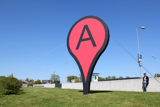 Map (Tallinn, Estonia) installation by Arem Bartholl.
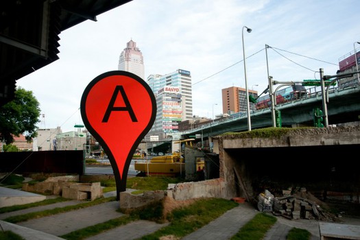 Map (Taipei) installataion by Arem Bartholl
My own moment of realizing that the Google Maps pin was becoming quasi-iconic involved something rather less spectacular: a felt version of the pin, included among the DIY projects in a how-to book called I Felt Awesome, by Moxie (via Craftypod). There’s not much interrogation of the symbol here: The pin is simply a benign and familiar presence, something to have around the house — decorative, the way a map can be decorative. (This, by the way, is another example of something from the digital world crossing over to the physical — dedigitization, or whatever you prefer to call it.)
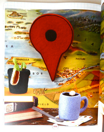
Felt Google Maps pin, by Moxie
Illustrator Alejo Malia has incorporated the pin, and other symbols from Google Maps, into a series called Google’s World. (I’m also fond of one depicting the yellow Street View figure, blankly looming in the urban environment.)
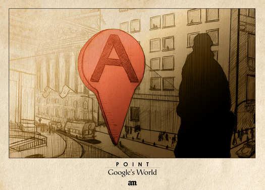 Point, illustration by Alejo Malia
Even Metahaven’s various first-draft proposals for devising a new visual identity for Wikileaks included some ideas that incorporated the pin. This perhaps evoked Wikileaks’ global nature, but the pin also gets inverted, to suggest the drip of a leak (and possibly to suggest as well as that the precise source of information cannot, in fact, be pinpointed). The example below is via this e-flux interview with Julian Assange, illustrated by a variety of Metahaven’s Wikileaks identity studies.
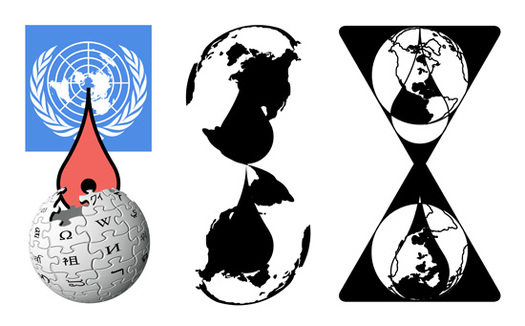 From “Design for Wikileaks” studies, by Metahaven.
Hilary Greenbaum, writing for The New York Times Magazine’s 6th Floor blog, recently quizzed Google about who designed the pin. The answer: Jens Rasmussen, who was a founder of a mapping company Google acquired, and who remains an engineer there. Greenbaum quotes a Google spokesperson: “Jens spent a lot of time thinking about what was appropriate to use as a pin — he avoided putting a dot or star flat on the map because it tended to obscure the area.” Presumably the last thing on his mind was coming up with a solution that would take on a life of its own, recognizable enough to stick up for itself in the art and design projects of others.
But that’s what happened. And as it turns out, Google itself must be aware of this, as the company now sells “I Am Here” T-shirts — commodifying its accidental icon.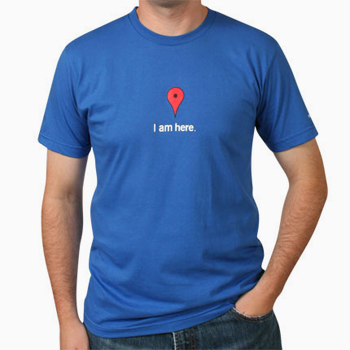
Google Map T-Shirt, by Google


Comments [5]
I love the Arem Bartholl pieces.
06.16.11
09:32
06.17.11
10:24
I'm not totally certain on HTML in the comments so bear with me:
Mockitecture:
http://mockitecture.blogspot.com/2010/03/going-gaga-for-google.html
@N_O_R_T_O_N:
@N_O_R_T_O_N
06.20.11
07:59
07.11.11
11:17
http://rhizome.org/editorial/2011/aug/24/artist-profile-aram-bartholl/
08.30.11
07:51