There's a box in our spare room, full of cassettes. Actually there are two boxes full of cassettes. And maybe more to the point, both are buried beneath a variety of unrelated objects that have piled up over the years, because of course I never listen to cassettes anymore.
But the other night I dug through the junk and into the boxes in search of old mixtapes. We'd been having one of those conversations people my age have about mixtape culture — all the effort and care and hassle it took to make one, etc. — and I started remembering specific tapes I'd received.
And I realized I wasn't thinking about wanting to listen to these old cassettes. I wanted to see them.
The mixtape aesthetic — if we can call it that — evolved as an afterthought to the practice of compiling songs for friends. But it happened at an interesting moment.
Whether you knew a thing about design or not (and I think it's fair to say that in that era neither I nor most of my friends had ever thought much about it) you had to package a mixtape.
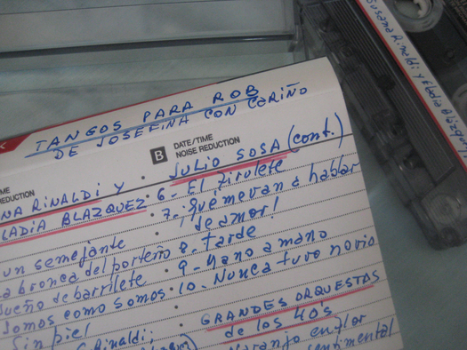
This was most typically resolved with a pen: Use the packaging that came with the blank cassette, and supply the relevant details by hand. At that time, this was simply the most convenient way to proceed. In retrospect, even the most straightforward presentation of an old friend's handwriting (per above) is a delight.
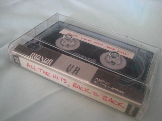
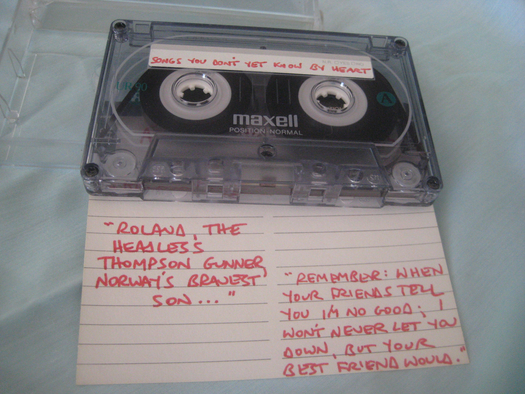
There's also something charmingly DIY-ish in the look of some of the handwritten solutions — attempts to break with norms even if only a bit, with the limited tool of a ball-point or felt-tip pen.
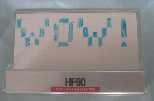
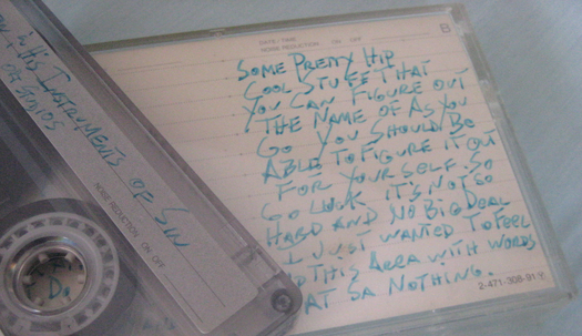
The cassette at the top of this post is my favorite (re)discovery along these lines. I love seeing my old friend's handwritten version of lorem ipsum filling space where he knew information was expected, but didn't care to provide it. The ball-point "WOW" is totally gratuitous, and I love that, too.
The example directly above includes quotes from some of the songs on the tape itself. The one below was made by a colleague when we were both basically kids working at The Nation — thus the creatively rendered title.
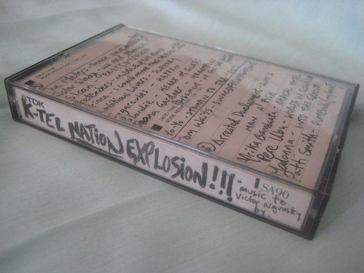
Meanwhile, some departed from handwriting — or even from disclosing standard information like a title or the actual song list.
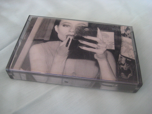
Below: A neatly executed improvised tape cover cut from a magazine.
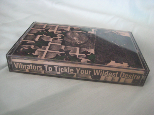
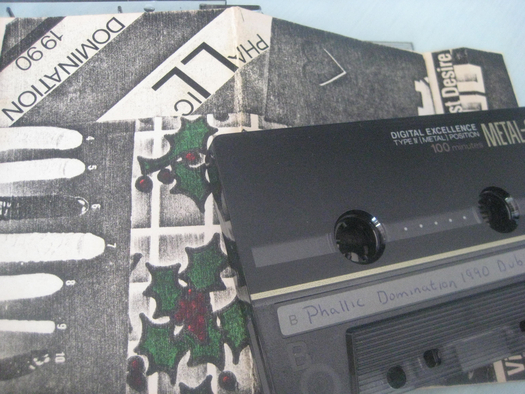
This next one is from a creative friend who liked to embarrass me whenever he could. He listed no songs, but went to the trouble of making a physical cut-and-paste collage cover (with no relation to the music whatsoever), from Xeroxed materials.
The visually bold and screamingly obnoxious title is, as a design decision, something between a prank and a dare: Recall that at the time it was routine to display cassette spines in places visitors could browse one's collection.
At around this same time, everybody was getting computers and printers and learning that word-processing software offered a variety of font choices.
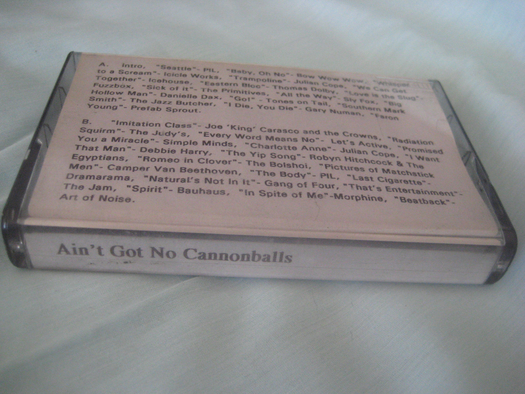
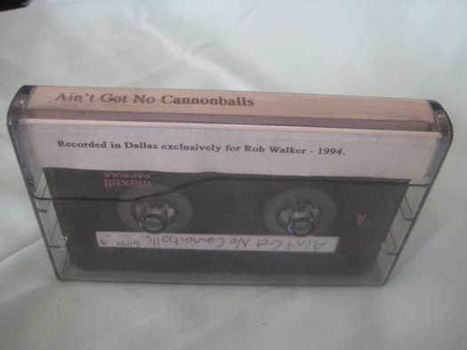
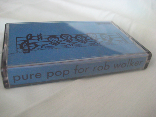
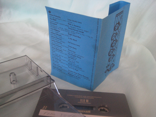
I don't think the motivation for going the computer route for generating mixtape packaging back then went much beyond "more legible than handwriting." Yet there was still room to be personal. Actually there was still a need to be personal, an expectation. That's why I think this turns out to be an interesting period to revisit via these objects. There was an outbreak of one-to-one packaging.
It was a transitional moment in some senses, and a simply vanished one in others. In general, music is now less associated with objects, period. Something like a Spotify playlist tends to get "shared" with a more abstract crowd of "friends" — and it looks like every other Spotify playlist. Even if you go the comparatively old-school route of burning a mix CD, iTunes provides a variety of readymade, automated templates for churning out the appropriate packaging. Just takes a click or two.
But even these last two example below, while they took advantage of desktop computers, required more thought and effort. It's natural, in that circumstance, to take steps that mix quasi-"professional" aesthetics (compared to handwriting, I mean) with specific personal details.
I'm not sure I ever really appreciated that until now, looking backward through the lens of what music mixes have become. It reminds me of scrapbooking, as addressed by Jessica Helfand — individuals making visual and aesthetic decisions for a highly select audience and completely outside the formal context of design. Like old scrapbooks (before scrapbooking became semi-digitized industry), these mixtape packages didn't seem incredibly striking at the time, and on purely formal terms can't match what's possible today.
And yet ... I admire what was done before it was push-button easy to do it. Maybe I'm just being nostalgic. But since the intended audience for these tape covers was me, I may as well say it: Thank you, I love them.
