Typojanchi 2015, the 4th International Typography Biennale is an oddity—a biennial devoted to typography. In many ways it’s just like one of the numerous art biennials staged around the world, but it differs in one crucial respect: the work at Typojanchi is far less self-regarding than in most art biennials and art fairs.
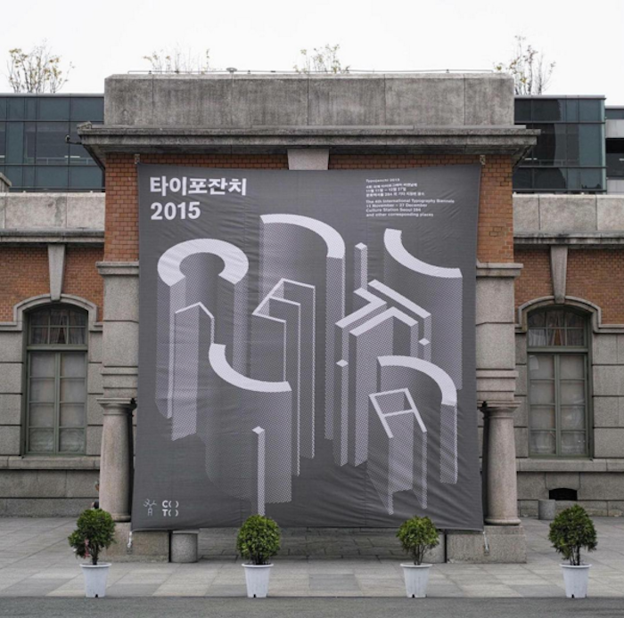

Typojanchi is held in Seoul, South Korea. It is a mixture of exhibitions, talks, and publications, with contributions from local and international designers and typographers. It is well funded, intellectually ambitious, and richly creative. It attracts large numbers of visitors—students, professionals and “civilians”—and most impressively, succeeds in turning typography into a subject of pleasure and learning, devoid of the usual overtones of dryness and closed-shop expertise.
This year’s theme is “typography and the city.” Typojanchi’s organizers, under the energetic leadership of graphic designer Kym Kyungsun, take the view that since the modern urban environment—both commercial and civic—is saturated with typography, lettering, and texts, it's an aspect of city life as worthy of our attention and critical scrutiny as any other. Typography, as their website states, is one of the “meaningful components of a diverse, urban environment. And with all of these components, we embark on a celebration or janchi of typography.”
When I say that the work in Typojanchi is less self-regarding than the work found in most art biennals, I mean that it is free from the intellectual sodium glutamate found in so many artworks designed to attract the rich and supported by the sort of art world mercenaries who make the marketing teams at Unilever look like Cistercian monks. The work in Typojanchi 2015 is lean and outward looking. For the most part, the exhibiting designers subject the contemporary urban typographic landscape to forensic examination. They do this in a lucid and engaging way, rendering typography accessible to a non-professional audience, and as a source of visual pleasure. Apart from the mild (and in my experience, vain) hope that a piece of exhibited work might lead to a future commercial commission, no one is selling anything.

As a Westerner attending and participating in Typojanchi, and as a veteran of numerous design gatherings and conferences around the world, I was most struck by the level of support given to the event by civic, craft, and commercial bodies. Typojanchi is hosted by a heavyweight conglomerate comprising the Korean Ministry of Culture, Sports and Tourism, the Korean Craft and Design Foundation, and the Korean Society of Typography. Sponsorship is provided by, among others, Naver, the “Korean Google,” resulting in a prominent city center location for the main exhibition; a well-resourced location for talks; and generous accommodation for participants.
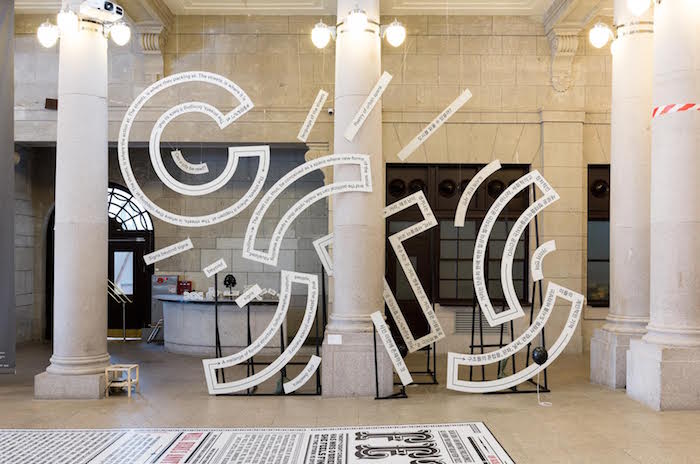
This level of support given to Typojanchi would be unusual in an equivalent Western event. Especially remarkable from a British perspective is the participation of a Korean government department. My own experience in 2013 of trying to get the eccentric Mayor of London to voice support for a comparable event in London came to nothing. So what does the Korean government hope to get out of their support? There are no super-rich oligarchs arriving on yachts and in private jets. The exhibitors are unknown outside of the micro world of graphic design. Local media interest was surprisingly high (far higher than it would be in the West), but Typojanchi was hardly front-page news in Korea.
Perhaps it is a sign of advanced thinking on design and its role in the health of cites and national cultures, that is taking place in countries such as Korea. The twenty-first century will not become the “Asian Century,” as many predict, without design, in all its facets, as a core ingredient. It seems that in Korea at least, this much is recognized.
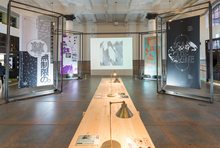
Typojanchi 2015 is on now and runs until December 27, 2015.

Comments [3]
12.07.15
03:54
12.11.15
01:08
12.16.15
02:30