Recently George Lois donated his entire archive of his groundbreaking advertising work from 1953 to the present day to The City College of New York (CCNY). From ads for Xerox and MTV, as well as covers for Esquire magazine, his savvy blend of street smarts and sophistication defined the visual language of a generation, and continues to influence visual culture today. To mark the occasion of his donation, this is a newly edited version of a post that originally ran in 2008.
++++
If you walked into the Four Seasons Restaurant in the early 1960s you would find George Lois at table number 37, one booth over from what would soon be Andy Warhol’s favorite spot. He might have been eating dover sole and drinking a glass of white wine but he also would be working: sketching, brainstorming or pitching for another advertising account. Lois was a contender. His ad campaigns were a pugnacious mixture of visual bravado and conceptual street smarts. He wanted his work to have impact. “I think advertising should be like poison gas. It should grip you by the throat, it should bowl you over, it should knock you on your ass.”
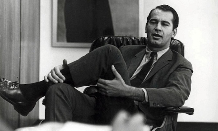
Lois was one of a handful of men and women who were at the forefront of what would later be called the “creative revolution”: an insurgency against the conventions of the old guard and the people who ran those agencies: the men in the proverbial grey flannel suits, who actually did drink martinis at lunch and take the 5:04 commuter train back to their plush homes in Westport, CT. Lois was part of the new generation, many of whom were Jewish, Irish, or Italian. “They are the precursors of the counterculture. They discovered ways of using advertising to embrace this new ethic”, says Joel Meyerowitz, now a well-known photographer but who was, in the early 1960s, another ambitious kid from the Bronx who was trying to break into the glamorous world of advertising “It was like hipster insider stuff.” Lois understood this instinctively. “I understood the culture, and I understood how to get ahead of the culture” he recalls now, “I used to say that I wanted to be thirteen weeks ahead, which is the length of a TV cycle."
A streetwise Greek kid born of immigrant parents, he grew up in a tough working class Irish neighborhood (with a nose, broken nine times, to prove it). His father was a florist and the young Lois absorbed his pride in craftsmanship, his eye for beauty, and his capacity for hard work. After a stint in art school, Lois launched himself into the world of advertising and immediately clashed with the staid establishment. When one account executive, asserting his authority, deliberately stepped on his layouts, which had been carefully laid out on the floor for his inspection, Lois quickly rolled up his art work, grabbed the man’s desk and flipped it over, sending papers and the contents of the drawers flying.
Lois was a rebel adman with a cause. That cause was to create ads that connected with the public, that weren’t nostalgic, or condescending, or full of puffery. He had no interest in continuing the visual legacy of the conformist 1950s: the nostalgic depictions of idealized family life, with earnest product descriptions and smarmy text. He was inspired by modernist design, with lots of white space and powerful images. In 1959 he worked on the Volkswagen campaign for Doyle Dane Bernbach. DDB was the hot agency of the moment, run by another outsider, Bill Bernbach. Bernbach encouraged his art directors to work directly with copywriters in small non-hierarchical teams that generated creative energy, as opposed to the heavy-handed account-led system favored by the larger, more established firms. Lois enjoyed working at DDB so much that he set his office alarm clock to go off at midnight to remind himself to go home. At DDB, Lois teamed up with a brilliant and eccentric copywriter, Julian Koenig. Koenig, with another DDB art director named Helmut Krone, had come up with immortal “think small” copy for the VW bug, ads that had single-handily taken on the ultimate symbol of consumerist society, the baroque chrome and metal Detroit automobile. The VW bug was the antithesis: small, unchanging in its design, and economical.
Lois and Koenig were sent to Wolfsburg, Germany by DDB to tour the VW factory in the hope that an on-site inspection would generate creative ideas. When touring the town, they asked their German guide to point out where the ovens had been, and when they spotted the spire of a picturesque church, they compared it to the caisson of a V-2 rocket. Dr. Nordhoff, then head of VW, refused to speak to them again. Back in New York they told Bernbach that they hadn’t come up with any new advertising ideas but they had clarified a marketing problem: they had to “sell a Nazi car in a Jewish town.”
A year later, Koenig and Lois and an account man named Fred Papert, decided to strike out on their own and set up Papert Koenig Lois, or PKL. On January 1, 1960, they took offices in the sleek new Seagram Building, the Mies van der Rohe skyscraper that epitomized the cutting edge of modern design. “I didn’t have the money to pay the rent. I didn’t have an account. It was just five of us and passion.” The passion, along with their talent was enough; within a week they landed an account with Renault. They were up and running. Set up like a mini-DDB, with art and copy teams working in tandem with a minimum of bureaucracy, they quickly made an impact with their racy, visually striking campaigns.
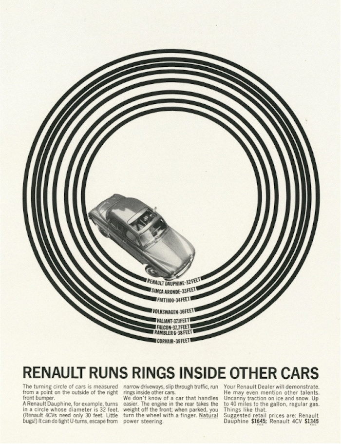
An ad from the PKL Renault campaign
Lois was also quick to exploit the new medium of television. When the agency landed the account for a duplicating machine made by an obscure firm called Haloid-Xerox, he decided that the best way to spend their meager budget was not to launch a conventional print campaign but to make a bold and arresting statement on TV that would turn Xerox into a household name. He needed a gimmick that would grab attention. He shot an ad with a little girl, who is asked by her father to make a copy of a letter. She skips over to the Xerox machine with a rag doll under her arm, pushes a few buttons, copies the letter and then puts the rag doll face down and copies the doll as well.
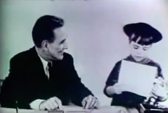

A still from the original Xerox ad. After questions from competitors the little girl was replaced with a chimp in a re-shoot, below.
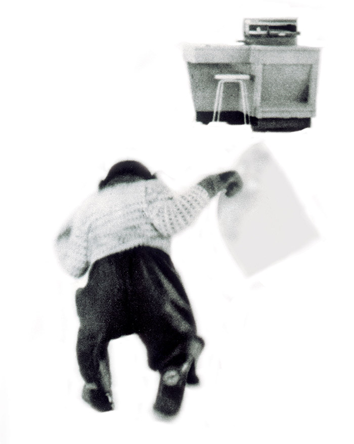

The ad ran during a CBS television news special and Xerox’s competitors cried foul: no copier could work that easily, they declared. The Federal Trade Commission was asked to verify that the ad wasn’t a hoax. To prove that it wasn’t Lois scheduled a reshoot. He invited the FTC and the executives of CBS to the set. But instead of using the little girl, he brought in a monkey. With the cameras rolling, the chimp waddled over to the machine, dropped a letter onto the copier, punched some buttons and twisted some knobs, and bingo out came a copy of a letter. Lois had not only proved his point but he also shot a much better ad. Sales of the Xerox 914 took off (you can see the ad here).
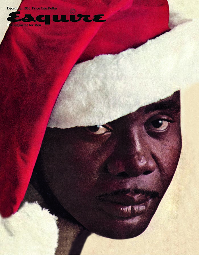
George Lois' iconic Esquire cover of Sonny Liston.
But Lois’s most significant contribution to the culture of the 1960s was the covers that he produced for Esquire magazine. They were demonically inventive and visually bold; they helped the circulation for that magazine soar. The best hinge on the contradiction of opposites: a young naked model, dumped unceremoniously in a trashcan with the headline: "The New American Woman: Through at 21." Or the face of Sonny Liston, the menacing heavyweight boxer, who had been imprisoned for robbery, posed as a black Santa Claus for a December issue at a time when racial tension gripped the country. According to Lois, Time called that cover “one of the greatest social statements of the plastic arts since Picasso’s Guernica.” His most famous cover, though, is of Muhammad Ali, posed martyr-like as St. Sebastian with arrows piercing his body. This was shot when Ali waiting for the Supreme Court to overturn his conviction for draft evasion.
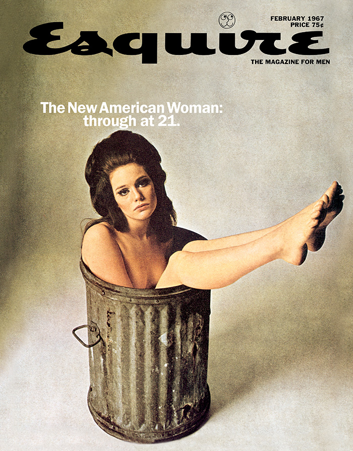
"The New American Woman" cover
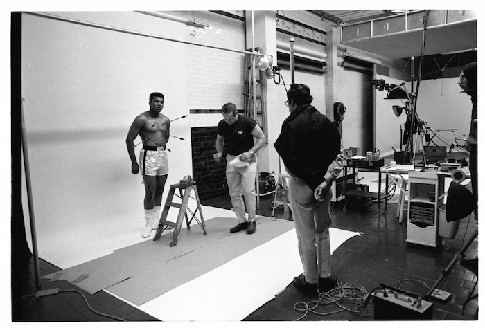
George Lois and photographer Carl Fischer with Muhammad Ali, 1968
Ali was out on bail but barred from boxing. Esquire was running an article about his agony of being in legal limbo. To show Ali his concept for the cover, Lois brought a postcard of the famous painting of St. Sebastian in the Met's collection to the studio on the day of the shoot. The boxer studied the painting carefully and pointed out a problem: the painting was of a Christian and he was, famously, a convert to Islam. Ali got on the phone to his spiritual advisor, Herbert Muhammad, to discuss the problem. After a detailed theological conversation, Ali agreed to be photographed nailed to the cross. As Lois fixed the arrows to his body, he recalled that when Ali had converted he had declared: “I don’t have to be who you want me to be. I’m free to be who I want.” Looking at the relaxed Ali posing as St. Sebastian, Lois saw a man who felt entirely free to be himself.
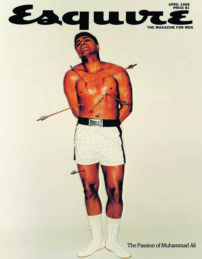
The finished product of the Ali shoot.
By the mid 1960s PKL was raking in over $30 million dollars a year. The company was the first successful advertising start-up since Bill Bernbach and David Ogilvy had established their agencies in the 1940s. Other small, creative boutique agencies were starting to pop up all over New York, often in imitation of the PKL template. Lois, the profane, scrappy ethnic kid from the Bronx had successfully left his mark in a world that had previously been ruled by men known more for their clubby conviviality than their knowledge of modernist design or their ability to throw left hooks. He was now famous in his own right. The creative revolution was in full swing. The notoriety, and the work that continued to come in as a result, helped him offset the cost of the 9,784 lunches that he was, according to his own count, to eat at the Four Seasons.


Comments [2]
02.24.16
07:22
02.28.16
09:52