The emblematic simplicity of the Google homepage was a bit of a happy accident. Initially left bare because the cofounders lacked HTML skills, its white space, and minimal links quickly distinguished the search engine from the overwhelming, content-heavy homepages of its competitors. This absence of videos, ads, and graphics (save for the occasional doodle and iconic “I’m Feeling Lucky” button) helped them reach the company’s topmost priority: faster site speed and search results. Marissa Mayer, Google employee number 20 and self-described gatekeeper of the homepage, described it best: “It gives you what you want, when you want it, rather than everything you could ever want, even when you don’t.”
While simplicity had lived at the heart of Google’s design and UX philosophy since day one, the company was growing exponentially. By 2011, the company had made more than 100 acquisitions to expand beyond search: from maps and email to mobile devices and advertising, and showed no signs of slowing down. As Google became more complex, there was a need for a cohesive UX across its disjointed products and services. It wasn’t until co-founder Larry Page ordered a visual refresh of its products that Google began to reconnect to its original design values.
Today, the company has mastered the art of identity and UX design. Striking a balance between simplicity, consistency, and delight, Google’s products and experiences aren’t just pleasing to the eye. They’re also intuitive—an increasingly important, yet oft-forgotten, element in this tech-centric world. Its design principles, such as “Focus on the user and all else will follow,” are evident throughout its complex portfolio: from hardware to software and every touchpoint in between. And when paired with increasingly intelligent algorithms that can predict what users want and when they want it, Google’s focus on design isn’t just beautiful; it’s personal.
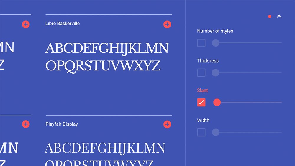
First launched in 2010, the Google Fonts directory was updated to Material Design in 201, making it easier to browse, test, and use open source designer fonts.
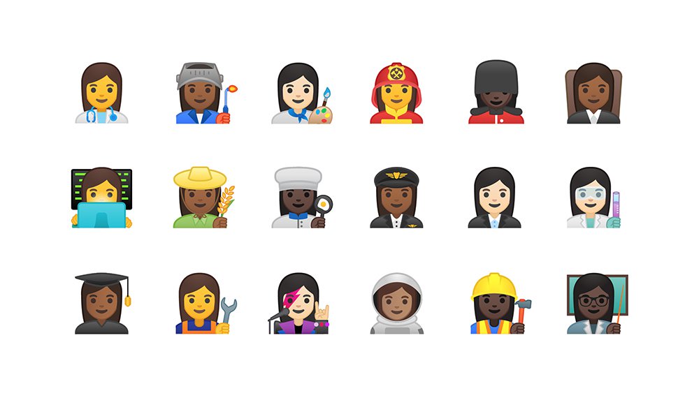
Google successfully proposed the addition of 13 new Unicode emoji, to better reflect women's professional roles in society, 2016.
At the same time that Google was transforming its internal design legacy, it was also investing heavily in the development of the global design community. The Endangered Languages Project, which launched in 2012, sought to preserve over 3,000 languages at risk of extinction from the modern age. Material Design, Google’s guidelines for visual language in technology, continues to be a rich resource for designers and technologists in creating thoughtful and purposeful UX experiences. Not to mention the wealth of best practices available to the design community, covering everything from creating a thoughtful persona for voice-enabled AI to putting humans at the center of machine-learning.
Google’s commitment to design extends to its corporate offices as well, with long-lasting effects on its employees, the community, and the planet. According to an environmental progress report released by Google in 2017, 9.3 million square feet of Google office facilities had achieved LEED certification as of the end of 2016. According to that same report, Google’s goal of designing efficient data centers was also realized: its data centers use 50% less energy than a typical data center and deliver more than 3.5 times the computing power as five years ago—with the same amount of electrical power. The company regularly looks for ways to improve its sourcing and cooling technologies as water becomes more and more scarce, especially on the west coast, where it is headquartered.
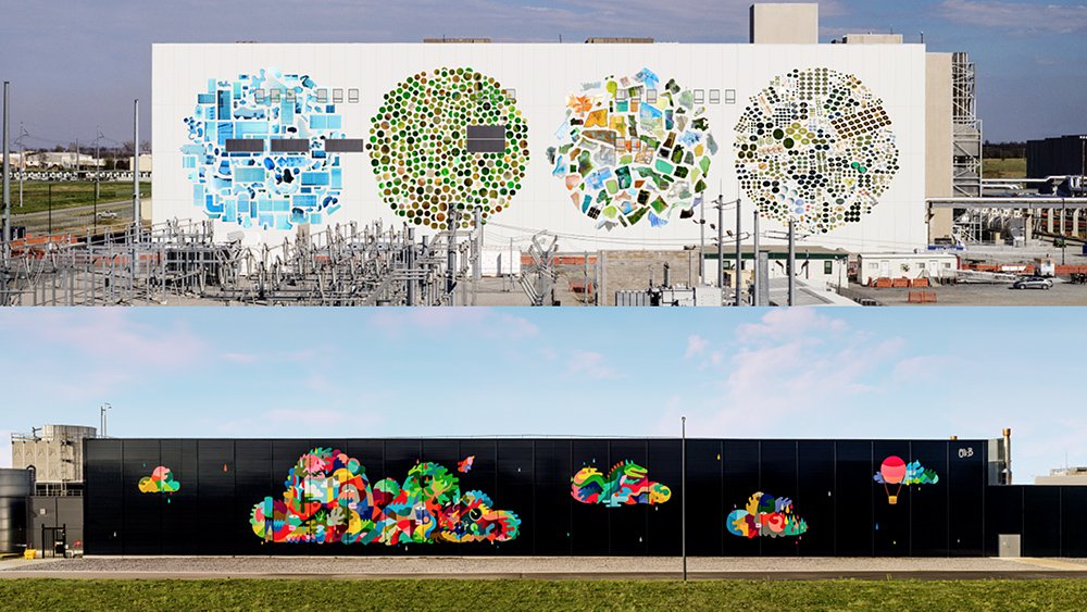
The Data Center Mural Project pairs artists with Google infrastructure. From top to bottom: Mayes County by Jenny Odell, St. Ghislain by Oli-B.
Google’s commitment to design is evident in every arm of the multinational organization and the communities it touches. It is for that reason that the AIGA was thrilled to honor Google with this year’s Corporate Leadership Award. Thank you for contributions to progressing the design and business communities. We look forward to sharing and celebrating your design journey in the coming years.
A glimpse into the design process behind the Google Pixel, 2016.
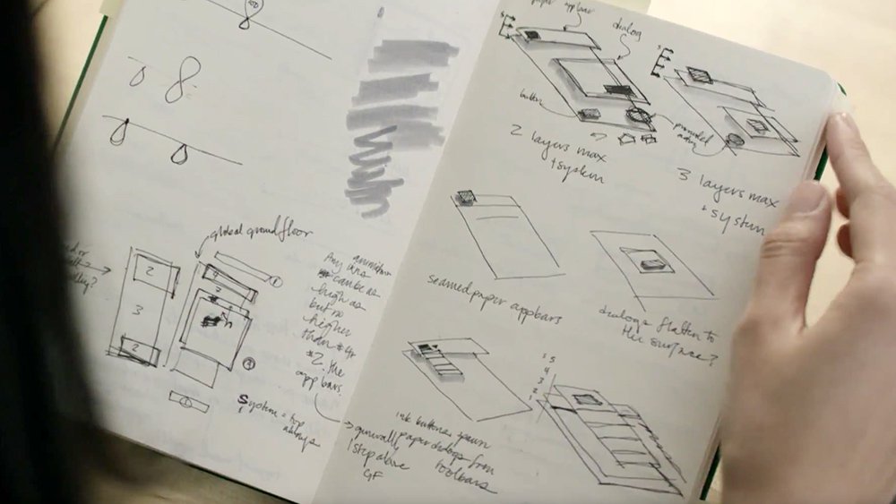
Early sketches illustrate the elevation system and visual layering used in Material Design. Still from "Making Material Design: Crafting Material" Youtube video, 2015.
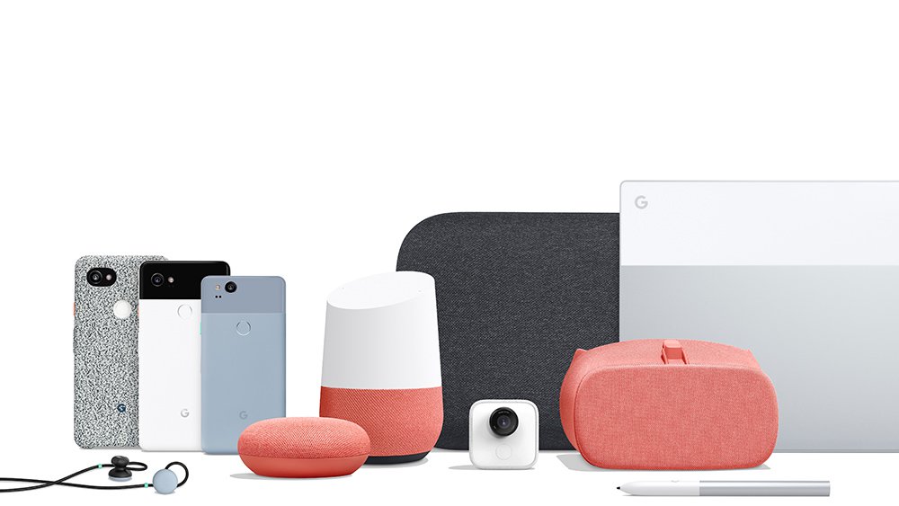
Hardware made by Google: Google Pixel Buds, Pixel 2 XL in a fabric case, Pixel 2 XL, Pixel 2, Google Home Mini, Google Home, Google Home Max, Google Clips, Daydream View, Pixelbook Pen, Google Pixelbook.

