Image courtesy of Nadine Chahine and Li Beirut.
It’s now been two months since the explosion in Beirut.
“The day of the blast, I froze. A familiar feeling of helplessness that many of us in the diaspora are trapped in. Families trying to somehow reach and hold their loved ones at home. My sister wrote a piece about the anguish. She chooses words. I lose my words. My process is to look at the innate sense of pain and honor what I cannot see.” Shares Maria Habib, a Lebanese designer, and educator based in the Washington DC area.
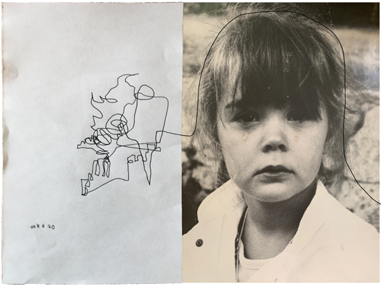
“on the inside”, sketch collage by Maria Habib (photo of Anna Habib during civil war, circa 1986).
Many people affected directly or indirectly chose different ways of addressing the emotions and results of this tragic incident. For Maria and Anna, it meant collaborating on a piece that synthesizes Anna's expression through words and Maria's through lines and images. Drawing with her eyes close, and letting the sensory experiences inside her leading the lines, a project initially planned to continue for 40 days, referencing the mourning period, but she expects to continue it for a year.
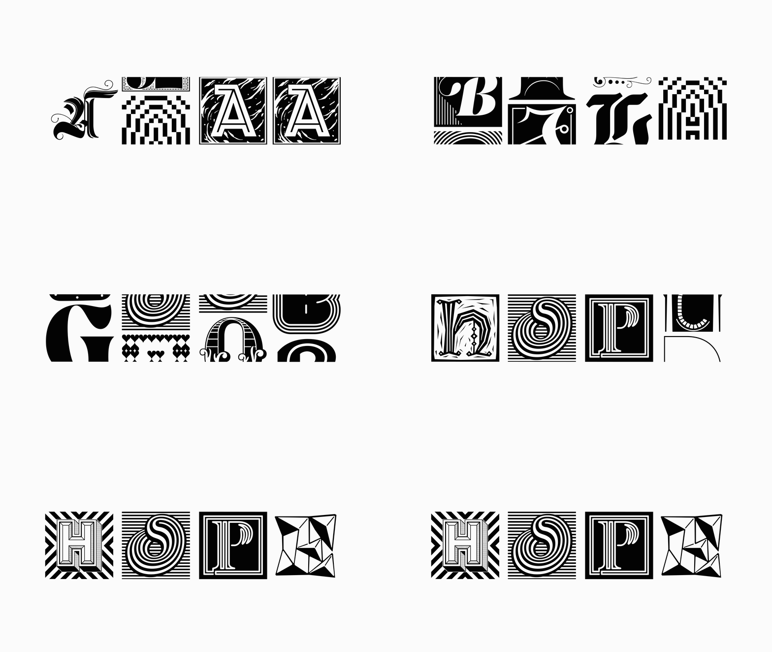
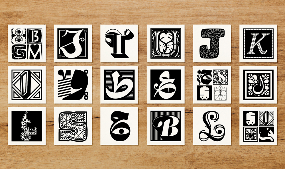
Within the week after the Beirut explosion in August, Dr. Nadine Chahine, lead a collective effort and curated a font with contributions from the international type community in support of the victims of the Beirut explosion and supporting reconstruction of the city. Not long after that, Li Beirut was created—a symbol of hope, love, and support of the international community and its solidarity with the people of Beirut.
With more than 300 glyphs in Arabic and Latin scripts, designed by 157 designers from around the world. Chahine had one request in the call for submissions, "one glyph of a letter set in a square ornamental background." The request for decorative design, which takes more time and love by nature, was informed by Chahine's expertise as a type designer too. "Decorative work takes time, and there is no gift more precious than time. Bringing together so many designers for a text typeface is impossible because it would need to have internal harmony. But what if there is harmony in discord? When every glyph is different, but by virtue of sharing the same size and a contrasting pattern of black and white, harmony can emerge." Said Chahine. Li Beirut is a collective font but in more ways than just the creation process and contributions of "letters of hope." The glyphs go hand in hand, with all their uniqueness and individuality, and work successfully as a collection. Each conveying a different emotion; together, hoping for making the world a better place.
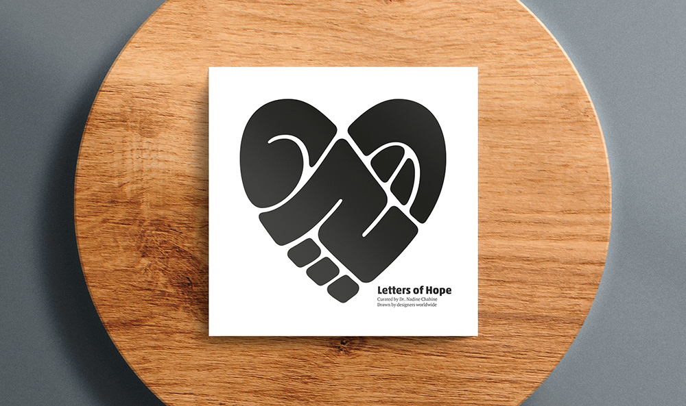
Images courtesy of Nadine Chahine and Li Beirut.
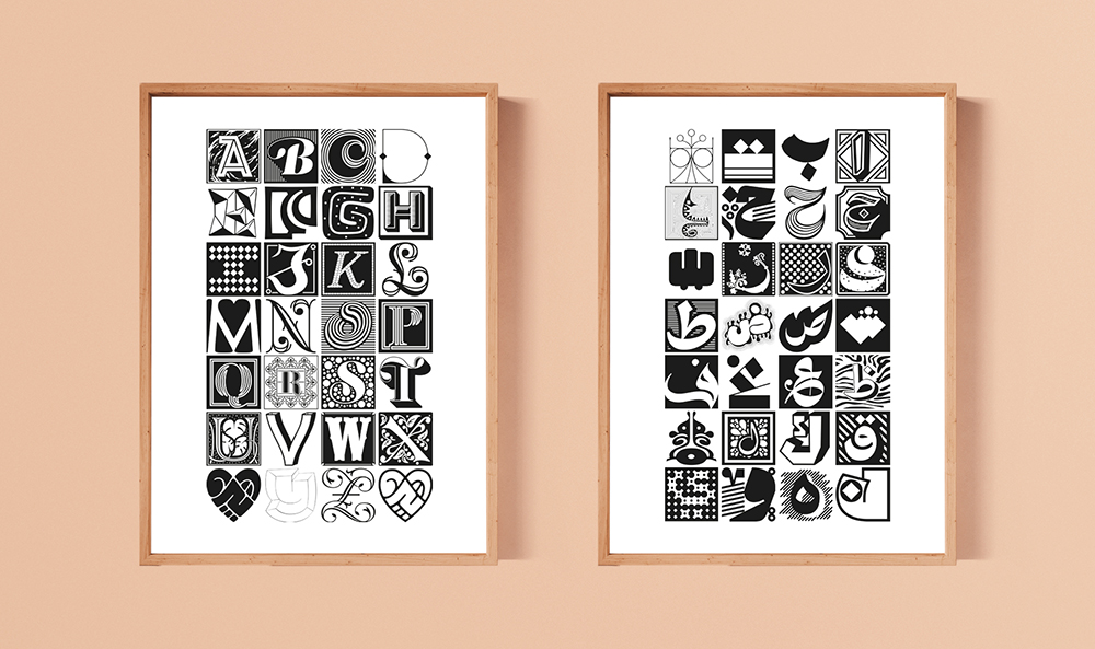
Li Beirut fonts and the additional materials including posters and postcards designed with it will be printed in Beirut and have been used for a fundraising campaign. All the profits from the campaign will be contributed to charities supporting the victims, including Action Against Hunger, Save The Children, and Plan International.
The Arab Fund for Arts and Culture—AFAC has organized Lebanon Solidarity Fund, supporting the arts and culture community in Beirut. Jarak is one example and a collective practice and social platform supporting the communities in Beirut, which was initiated after the covid-19 pandemic began and is continuing its support for communities in Beirut and the diaspora ever since.



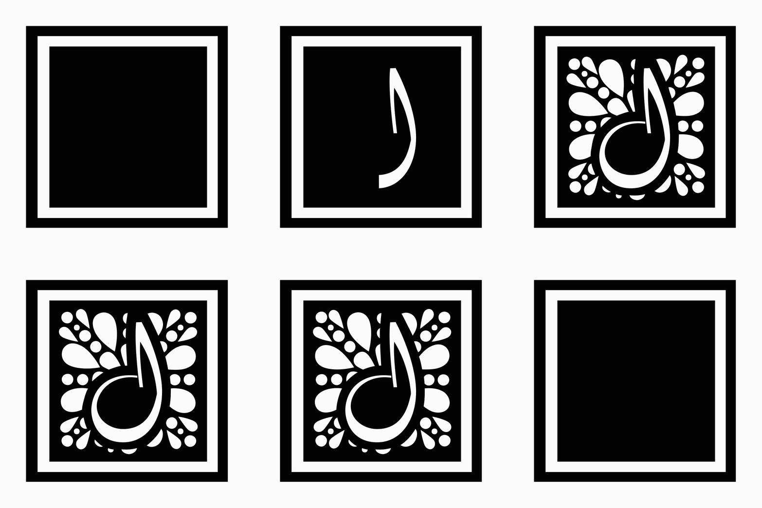
Type by itself may not always be sufficient in igniting change, or even the approachable or proper medium. But at its best, type becomes a platform. It inspires change. It evokes emotions. It brings hope. I witnessed the manifestation in at least two completely different collective projects this summer, helping me feel part of larger communities, even though spending most of my time in social confinement.

