There are many ways to be sent to hell. Some involve disobeying the Ten Commandments. As a designer, however, temptation looms at every corner, telling us, “It’s ok. Go ahead and use the Oil Paint filter in Photoshop. Don’t worry about using the fake handwriting rather than using your own hands. Why make your palette when a program can do it for you? So easy; then you can have time to be lazy.”
Now, everyone has a different concept of hell. Mine is being stuck at a party when someone pulls out a guitar to play songs about a broken heart. To avoid ending up at an endless amateur guitar playing party with people who share issues, I resist the temptation of software-generated color palettes. I make my own.
I’ve met many designers who are uncomfortable with color. At some point along the path, a well-meaning art teacher or parent said, “Oh no. Those colors don’t go together. They clash.” We are given the message: You can’t be trusted with your own color choices. There are right colors, wrong colors, good combinations, and bad combinations. But this is wrong. There are no bad colors or bad combinations. The only wrong choices (and not in a good John Bielenberg ThinkWrong way), are to use the default palette, work without color conviction, and let Adobe make the palette decisions. As long as a designer works with color aggressively, everything is good. Can you use rust and violet, or avocado green and yellow, or pink and red? Why not?
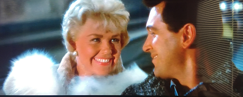
Pillow Talk, 1959. Director: Michael Gordon, Actors: Doris Day, Rock Hudson, Tony Randall
The first step to creating a great palette is starting with something you love. I would prefer to suggest I diligently review Johannes Itten’s color theory, or spend hours ruminating on Josef Albers compositions. But, I look for palettes in the mundane and, at times, plebian. I might find a eucalyptus leaf on a hike and scan it. Or, I discover set of pastel candy boxes in Rome.
And most recently, I deconstructed the palette from Pillow Talk (1959). I simply used my phone to snap images from the television. The color in Pillow Talk has the saturated and upbeat attitude of the late Eisenhower years. The palettes are clear, pure, simple, and optimistic. Like the plot of the film, the colors align with a light romantic comedy.
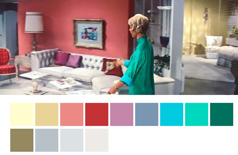
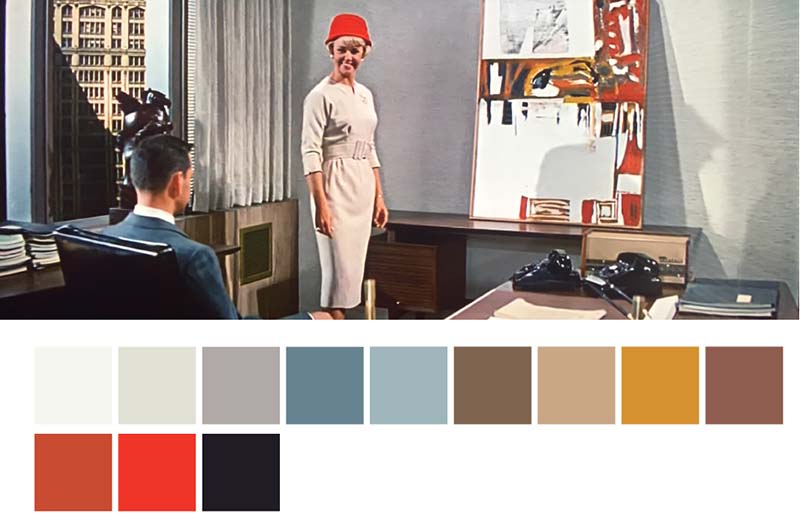
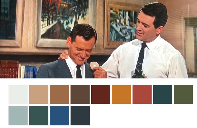
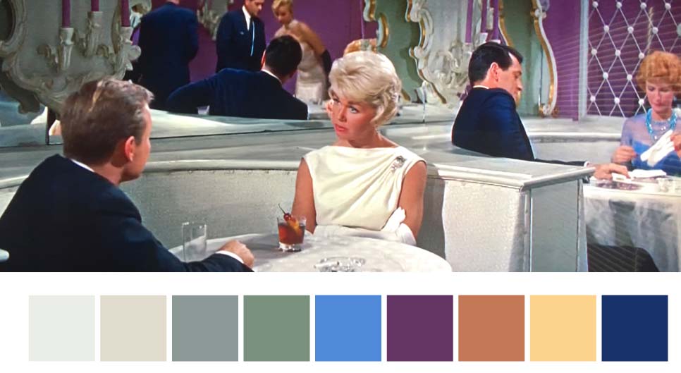
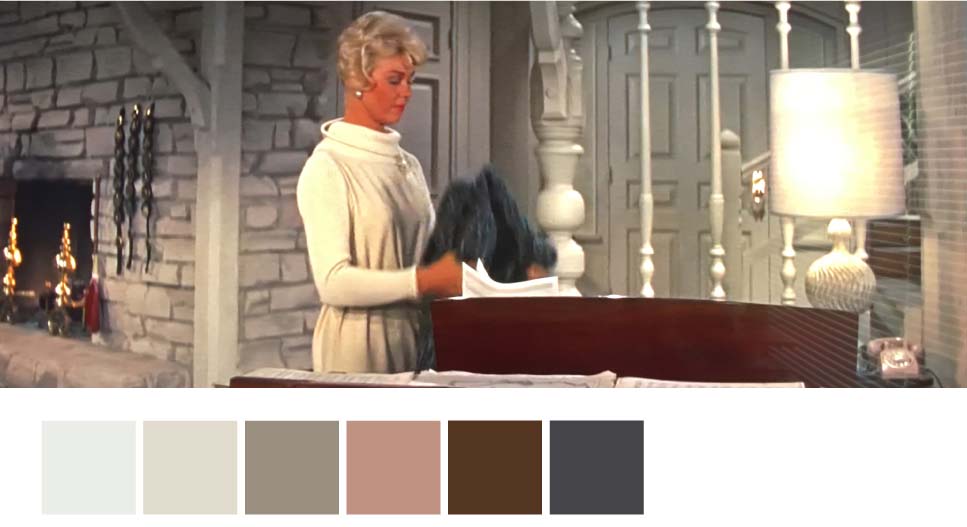
Pillow Talk, color palettes.
Here is the plot in brief: Jan Morrow (Doris Day) shares a party line (ask your grandparents) with Brad Allen (Rock Hudson). He romances multiple women over the telephone. This disturbs Morrow’s proper sensibilities. As they have never met in person, they bicker on the phone. At a supper club, Brad overhears Jan’s voice and now sees her in person. To pursue her, he pretends to be a visiting Texan, Rex Stetson (which sounds close to a pornography name). Pretending to be pure and gentlemanly, he slowly seduces Jan over several dates. Moments before surrendering herself to him (i.e., going to bed), she discovers the ruse and storms out.
Brad, now realizes he is in love with Jan. She won’t speak with him, but he asks her to redecorate his apartment. She uses every tacky and tasteless item possible for the redesign, resulting in his terror. During his ranting at her, he mentions he was planning to marry her. This solves all the issues, and the film ends with the suggestion that they marry and have many children.
The colors in Jan’s apartment are soft and pastel. One can’t be envious of her coral colored counter tops. Brad’s residence incorporates earth tones. When they are together, they exist with palettes in between these: jewel tones, grey, orange, and red. Granted, this isn’t Jacques Lacan, but the results create remarkably beautiful combinations. The palettes I can derive from Pillow Talk may not be of the highest order of sophistication and cultured, but this practice may save me from being rejected by Saint Peter at the pearly gates.
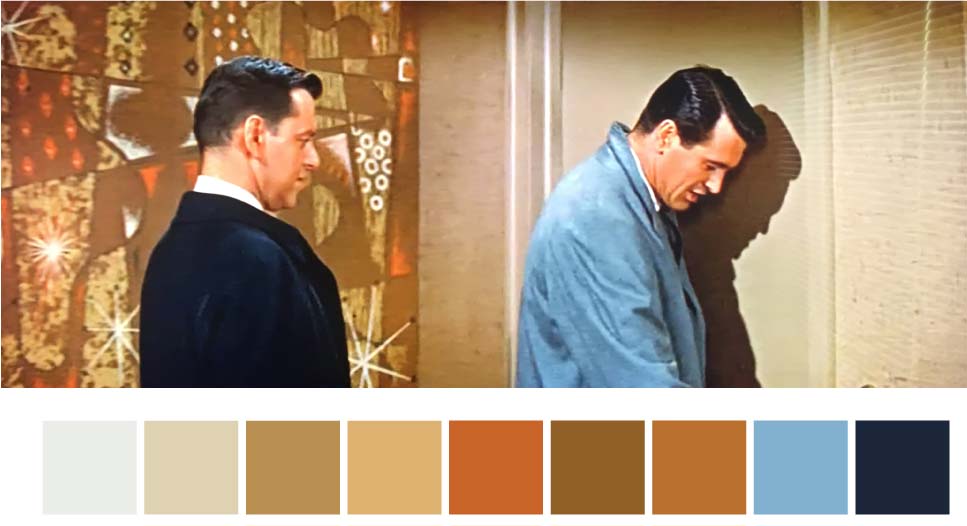
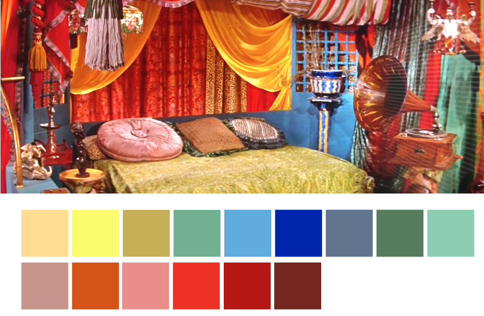
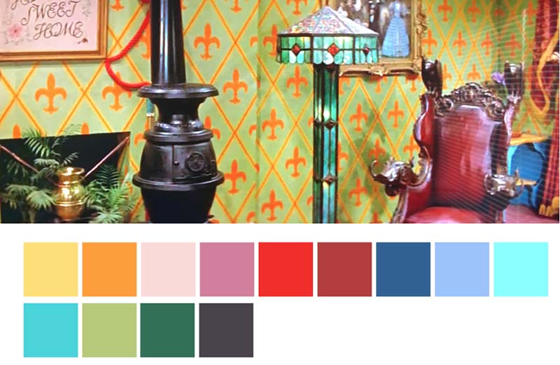
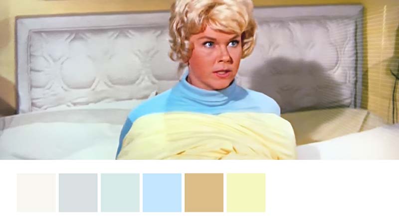
Color palettes

