This interview is part of an ongoing Design Observer series, Chain Letters, in which we ask leading design minds a few burning questions—and so do their peers, for a year-long conversation about the state of the industry.
This December, we’re elevating the act of gift giving by pondering the items inside the box: examining design as craft, poring over process, and picking the brains of designers whose technical skill turn products into objets d’art.
Victor Melendez is an art director, graphic designer, and illustrator based in Seattle. He has created award-winning work for a wide variety of clients that include REI, T-Mobile, Starbucks, Crayola, SubPop, 21st Amendment Brewery, Hallmark, Sasquatch! Music Festival, and many more.
Melendez’s multicultural upbringing gives him a unique approach to craft and style. This distinctive quality has given him the opportunity to not only produce captivating illustrative work but also explore different techniques such as printmaking, silkscreening, engraving, and mural painting.
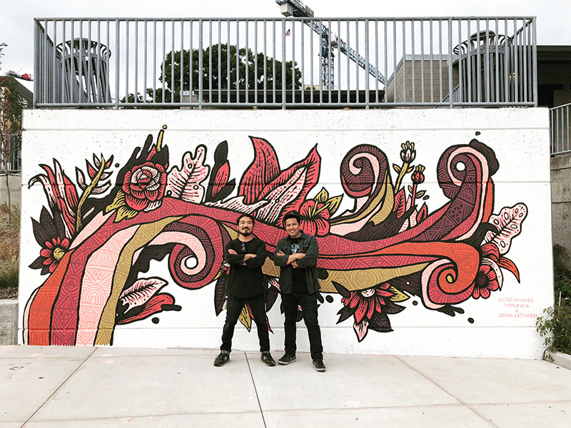
Victor Melendez and fellow Seattle designer, Shogo Ota in front of a mural made in collaboration with Urban Artworks and their youth program.
Walk us through your ideation process. What are a few key steps in taking a product from concept to production? How do you consider the end user?
I think consideration of the end user is paramount. I find myself doing lots of research before each project— everything from culture and traditions to design aesthetics and current events that relate to the audience. I also keep a folder of inspirational images and create a moodboard with references for color, style, typography, and design inspiration in general. At the same time, I write down ideas—even just individual words—that will lead to sketches.
I first sketch loose compositions in small thumbnails (nothing detailed, just shapes and lines) to establish a sense of flow. After a few thumbnails, I move on to a more elaborate sketch that contains loose type studies. This is often when I see the concepts take shape. I see what’s working, pick two or three sketches, and pair them with pieces of the moodboard. Once a concept is chosen, I start development, again taking into consideration the research I did at the beginning of the process.
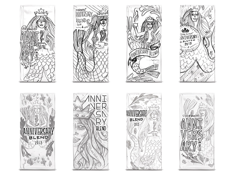
Starbucks Anniversary Blend preliminary compositional thumbnails.
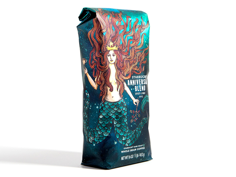
Starbucks Anniversary Blend packaging.
A lot of products that we use today were the outcomes of happy accidents. Have you ever made mistakes in the making process that helped you come up with a new idea or overcome a creative roadblock?
I often doodle or experiment with new media—anything from trying out new inks or markers to building something out of wood or modeling clay. I have found that trying something you have no experience with gives you a sense of freedom and makes you feel less restricted in the creative process.
This can work in a couple of ways. For one, it can clear your mind and pull you away from the project you’re stuck in, allowing you to go back to it with a new perspective. And, second, this experimentation often leads to new techniques that you just might be able to adapt for a current or future project.
What’s a trend that you wish would just die already?
Spec work. It often happens when big companies or government entities organize design contests for a new logo or brand identity, which allows them to choose from contest submissions rather than hiring a designer or agency outright. Nobody wins. Designers do the work by providing examples without compensation, and the entity that launched the contest gets a mediocre logo. I believe everyone deserves to be paid for the work they do.
The new mayor of Mexico City recently launched a contest to design a new logo for the city and as expected, the results were quite awful—and some were plagiarized. I don’t think people or companies run these kinds of contests out of malice. I choose to believe that they do it out of ignorance. But it’s our duty to educate and to remind people that this practice benefits no one, and in fact, damages the design practice.
What’s your favorite gift to give and why?
Framed artwork. Sometimes it’s mine, but often it’s someone else’s work. I try to buy art at local craft fairs or at a local market if I’m traveling. I see it as an opportunity to support local artists and to create a connection between the person I give the gift to, myself, the artist, and the community it came from.
I really recommend framing the work you’re going to give so that it’s ready to be displayed. The frame doesn’t have to be fancy, but the simple fact that it’s framed encourages the person to go ahead and put it up. I can’t tell you how many pieces of art I have just stored because I don’t have time to frame them or it’s just too expensive.
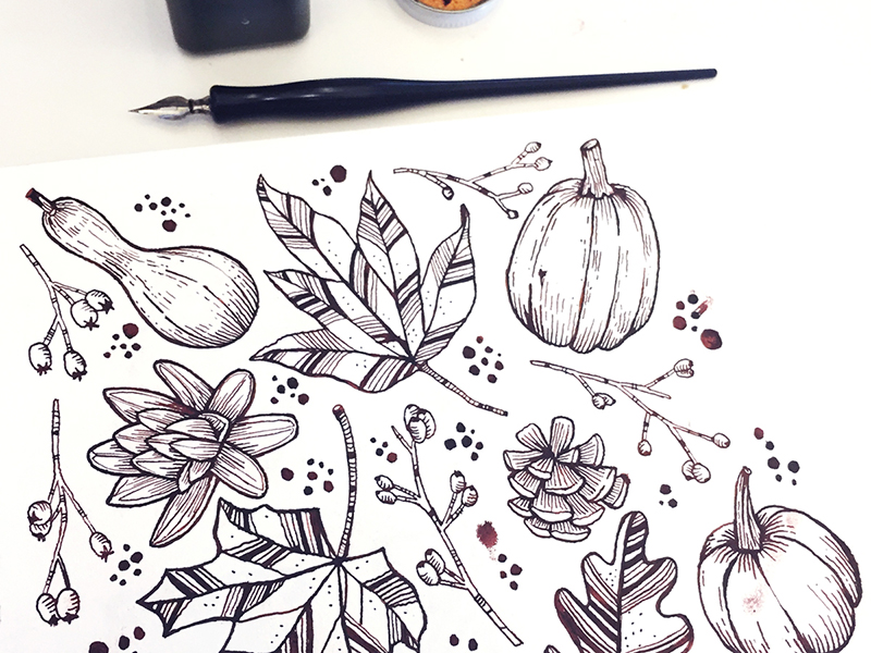
Starbucks Fall Promotion original drawings.
Next week Victor asks Nicole Licht + Melissa Deckert, founders of Party of One: As two different designers with different aesthetics, how do you translate your individual design sensibilities into a unified voice?

