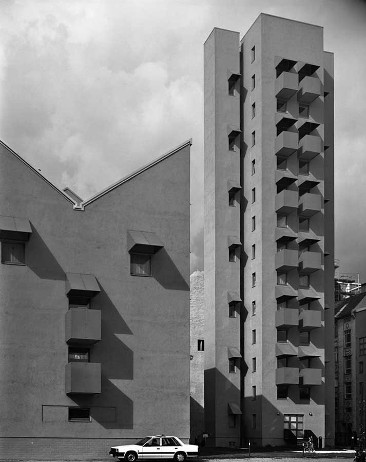
Kreuzberg Tower, Berlin, designed by John Hejduk, by Hélène Binet, 1988
In 1989, I visited Berlin to put together a special feature on the city for Blueprint magazine. The Kreuzberg Tower designed by John Hejduk (1929–2000) had been completed the previous year, and I was able to look around one of the two-story apartments, which was filled with unexpected light and had great views. The building, originally intended for artists, possessed an ambience of strangeness that Hejduk—an artist and poet, as well as an architect of ideas—liked to call an aura.
Hélène Binet, an architectural photographer, had taken pictures and we published a couple of them in color. They show an aspect of the housing block that can’t be seen here: the window frames, the awnings like peaked caps, and the steel boxes that form the cubic balconies are painted green, a shade inspired by the machines in nearby factories. With their sharp angles and flat gray walls, the fourteen-story tower and two adjoining but separate five-story wings look more like industrial buildings from the modernist era than late twentieth-century residences (see another view by Binet here). In 2010, alarming plans to refurbish the tower emerged. Drawings of the scheme promised purple balconies and crudely simplified canopies. After an international outcry and a petition signed by nearly 3,000, including distinguished architects and professors, the owners chose to pursue a more sensitive restoration. As Binet’s picture makes clear, the emphatic, idiosyncratic protrusions are integral to the building. Even to viewers who are unaware of Hejduk’s history of experimental projects and publications, they have the capacity to imply narrative and meaning, and possibly hint at a metaphysics.
Binet’s images show great affinity with Hejduk’s aims and her interpretations are the best I have seen. Since the publicity pictures first appeared in color, she has presented her studies in black and white—Hejduk’s book Vladivostok (1989) has a set—calling attention to the heavy volumes and the geometrical regularity and severity. In a variation shown on her website, Binet truncates the left-hand wing, crops the car and cyclist, and trims the neighboring building’s facade to focus more tightly on the repeated elements of the tower. This arguably makes a stronger picture, or at least one that is more of a unified world in itself, though it diminishes the sense of framing between the wings that gives the tower so much impact when standing in front of it.As ever in architectural photography, there is a tension between documenting how a building looks in situ, and pushing the photograph toward abstraction in order to accentuate the details that give a structure its particularity. That idealizing distillation often involves eliminating the signs of occupation and everyday use that can bring architecture to life. In this case, I prefer the pictorial “imperfection” of the cyclist and car.
See all Exposure columns

