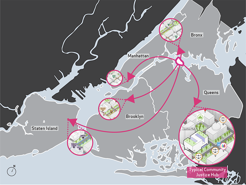
Justice In Design by NADAAA
When it comes to design work in the social sector, we often hear debates over terms, categories, and taxonomies: Should we call it social design? What about design for social innovation? Or how about the nebulous borders around terms like participatory design, collective impact, and co-design? It’s enough to make one’s head spin. But while these debates are raging on, we’re missing the answer to a much, much more important question. We’re missing a shared definition for what good looks like.
What does good look like?
I know a definition of good is missing because I’ve been asked to pinpoint it, with some fairly high stakes on the line. In the last 18 months, I’ve been invited to judge several design competitions, one for the National Endowment of the Arts, two for Fast Company (World Changing Ideas and Innovation By Design), and another for Core77, across categories like social impact, social good, and others. I couldn’t have been more honored to take part—all of those competitions are prestigious, and they have many, many compelling entries. But I quickly noticed that the guidance given to us as judges—to evaluate what good design looks like in the social sector—was limited at best.
The guidance given to us as judges—to evaluate what good design looks like in the social sector—was limited at best.
For instance, one set of guidelines reads, “Please consider the entries on the following criteria: functionality, originality, beauty, sustainability, depth of user insight, cultural impact, and business impact.” These guidelines are so broad, it's impossible to use as a rubric.
Why we lack criteria for “good.”
In talking to my fellow judges across the various competitions, we all agreed that the criteria, if any were given at all, felt outdated at best. And here’s where the social sector rubs up against some of the old principles for what “good” design has traditionally been. It’s still borrowing the same qualitative values from the commercial sector. Conventional design work that serves the needs of business has a very different set of values and goals, and logically has its own criteria for what good is.
Conventional design that solves business needs (mobile apps, new brands, physical products, and services) often evaluates the delicate balance between aesthetic and functional need, or said another way: how attractive is the form and how effective is the function?
Personally, when I look for a way to evaluate conventional design, I refer to Dieter Rams (a legendary industrial designer) and his principles of good design, regarded as canon for many.
- Good design is innovative
- Good design makes a product useful
- Good design is aesthetic
- Good design makes a product understandable
- Good design is unobtrusive
- Good design is honest
- Good design is long-lasting
- Good design is thorough down to the last detail
- Good design is environmentally friendly
- Good design is as little design as possible
Why this matters.
I will be the first to admit that helping out future judges of design competitions is a pretty niche set of users, but knowing how young this field still is, these decisions will have a lingering impact on what counts for years to come.
If we can agree on a new set of criteria for comparing, judging, or ranking work at the intersection of design and the social sector, we can push our nascent field forward.If we can agree on a new set of criteria for comparing, judging, or ranking work at the intersection of design and the social sector, we can push our nascent field forward. It can influence practitioners on how they scope and choose their future projects. It can shape how teachers and students plan their curriculum and projects respectively. It can prompt social sector leaders to ask more critical question of their design partners and perhaps most importantly, give the whole sector rhetorical tools to rein in funders and their disproportionate influence on the field. Reading Winners Take All by Anand Giridharadas, will let you see just how much gravitational pull funders have on the social sector.
Three principles of good design in the social sector.
I’m unbelievably fortunate to have co-founded a studio that has been working exclusively at the intersection of design and the social sector. We’ve completed over 100 projects with more than 50 social sector clients to date and are in a unique position to offer up a starting point for this discussion.
- Good design honors reality
- Good design creates ownership
- Good design builds power

No Fixed Address System by Chih Chiu
Good design honors reality.
No one has the right to be an expert on someone else’s life, but so often in the social sector, major decisions that affect millions of people living on the edge of poverty are made by those most insulated from that precarity. Why is the value of lived experience so discounted?
So often, the only kind of expertise we acknowledge comes through traditional methods like graduate school, professional experience, or academia. Let’s call this the “learned method.” There’s a level of expertise that designers often forget— people are experts in their own lives, and it’s shocking how little value we place on it. Let’s call this the “lived method.”
‘Learned vs. Lived’ are the two largest sources of expertise we have in the social sector, but only one gets research grant dollars and only one gets put on our LinkedIn profiles. Imagine graduating from Robert Taylor Homes with a doctorate in public housing or giving a TED talk on finance when you’ve learned how to feed a family of four on food stamps for a year. Perhaps experts in lived experience could replace the current set of thought leaders we fawn over that currently work the speaking circuits of the Inspiration Economy.
So, when reflecting on projects one can ask:
- How well has this project/team sought to understand the cultural, political and historical context that led to today’s reality?
- Does this project/team run the risk of capitalizing on the deficits of a community’s reality, in order to promote their work?
- How well has this project/team sought to find the innate assets and creativity already present in this context and tried to share it?
Good design creates ownership.
Professional design work carries an embedded conceit, a dirty secret if you will. Design work is built on the professional services model, which means that any further work created to the same quality needs to be completed by those same professionals. It’s a self-serving loop that conveniently keep power asymmetry in place and hourly fees high.
In the social design sector, however, we want people to need us less, not more. We can accomplish that by fostering a sense of ownership in those receiving the design work.
Good design makes space for those without formal training to shape and control the project itself. But that’s so counter to how the professional services field is set up that it’s perhaps forgivable that design teams don’t have much practice at building capacity in others.
You may ask, so if trained designers aren’t doing the design work, what the hell are we doing? Well, first of all, there’s still plenty to design—don’t worry, We must design the conditions where the constituents own the change we’re asking them to make because we’ve learned that when new ideas are created and decisions are made without the oversight of end-users, adoption of new behaviors will always be low. Therefore, we must design the engagement itself, not just the outcomes.
When reflecting on projects one can ask:
- What steps have we taken to prevent new dependencies from being created in this community?
- How has this project/team sought out the pre-existing capacity in this community and built upon it?
- How has this project/team made space for those it serves, giving them room to adapt and interpret the design process and shape outcomes?

AHA is Listening by verynice and The American Heart Association
AHA is Listening is a great example of a project that’s built ownership transfer into the engagement. The project’s framework ‘’states that to Learn with any community, AHA must Question, Listen, and Reflect.” They state that the Reflect phase “is included to help teams make sense of their findings, synthesize insights, and share them with [others] to consider next steps. As an iterative process, this is also a stage where it is important to check if the original research questions (i.e. the purpose of the study) [have] been adequately addressed or if new ones came up.”
Good design builds power.
I’ve written and spoken about design and its problematic relationship to power in the past, but it’s worth summarizing here. The design industry is filled with practitioners unaware of power’s role in complex social issues. And when funding for their project stands in the shadow of concentrated power, that project risks being an unwitting accomplice in maintaining power asymmetry as it is.
Community organizers have robust power analysis tools for mapping power in their work, but it starts with asking the simple but difficult question: who has power and how did they get it? Correspondingly, designers need to determine where power asymmetry lies in their relationship with their client (like a social sector leader), the funder, and the community.
Talking about power inevitably involves recognizing how much power the designer has and how they got it. And if you’ve not thought much about your power before, the next question to ponder is this: what privileges have insulated you from noticing how much power you have?
Like Eric Liu, I share a belief that power is not a zero-sum game and that it’s a remarkably renewable resource. If you turn away all projects involving a power asymmetry, you lose the potential opportunity to disrupt or redistribute it. But it would be grossly naive of me to think that just knowing power asymmetry exists is enough to address it. It’s not. And I would even go as far as to say that barely any of our projects in the last seven years as a studio have significantly built power. It’s just about the hardest design challenge there is. But losing sight of this goal would be a tragedy.
[Power is] just about the hardest design challenge there is. But losing sight of this goal would be a tragedy.
So, when reflecting on projects one can ask:
- How has this project/team acknowledged the role that concentrated pockets of power (including the role of the funder) have played in the history of this issue?
- What steps have this project/team taken to address the power asymmetry that occurs when the design team shows up?
- How do the tools/processes/strategies created from this project give this community access to power that was previously out of reach?
Where these principles come from.
When we at Greater Good looked back on our studio’s projects and saw the patterns across our 100 projects, we saw that these principles weren’t referencing conventional design at all. If anything, the careers of conventional designers are defined by altering reality, retaining ownership, and building our own power.
Instead, we realized we were calling on well-worn tenets from disciplines adjacent to ours. Our studio was founded on a simple observation: design changes behavior. So it would make sense that we can learn from other disciplines that are equally attuned to human behavior.
- Good design learns from anthropology
- Good design learns from social work
- Good design learns from community organizing
A new set of judges.
Being a judge for these competitions is a unique honor and privilege, one that only a handful of people a year get to experience. If we’re changing the criteria, it’s worth considering whether we should change the judges, too. If one were to take the three principles of good design to their natural and logical conclusion, one has to ask, “why do I get to be the judge of what good is?”
Wouldn’t it make the most sense that the only true judges of this work should be the very people whose lives are affected by these projects? And if the argument for not making community members judges in social impact competitions is based on their lack of formal training in design, then I humbly ask you reread the section on lived vs. learned expertise again.
Culture is shaped by what we celebrate, so when we align on what matters, our impact spreads far beyond deciding who gets to win.
Postscript
I owe a debt of gratitude to all my fellow judges who shared the impossible task of choosing winners from so many incredible entries. In particular, I’d like to thank Jennifer Rittner, Marc Dones, Sabiha Basrai and Kat Holmes whose conversations led to this piece. Thanks also to Kate Hanisian, Ramsey Ford and Doug Powell for their feedback on the piece. Thanks also to my editor Lindsay Muscato for her piercing clarity. And lastly, my thanks to my co-founder Sara Cantor Aye, for her tireless efforts in synthesize all our studio’s projects to develop the three principles presented here.
