Typography is far more than type design and layout. It touches on key values of our society: the printed free word, and the democratic discourse. It is thanks to the power of typography that this discourse has assumed the form of a game of argument and counter-argument.
The new-media technology calls into question our accepted notion of typographic communication. Not since Gutenberg’s invention of moveable type in the fifteenth century has typographic communication undergone such a fundamental change as today. The typographic trade finds itself at a crossroads. Can typography still play a significant role when digitization and new media are shaking the foundations of the typographic craft? What direction will it take in its further development?
In The Triumph of Typography twenty-one international experts in the fields of typography and communication share their expertise with fascinating analyses and examples. This book not only dwells on what moves and inspires today’s typographer, but also elaborates on new developments in the field of typography.
Petr van Blokland's essay comes from the book’s second section: "New Developments in the Field of Typography," which focuses on the role of typography in the new-media debate.
++++
The digitization of typography is usually seen as a watershed. I have chosen a different approach in which I make an appeal for retaining the basic values of typography, values we must not lose sight of in the heat of the revolutionary moment.
The discussion of typography and the new media has mainly to do with the possibilities and limitations of the production technique, and only to a lesser extent with the expectations and behavior of the reader. In fact it doesn’t really make much difference whether he reads his text from paper or from a screen. We are witnessing a development in which printed and electronic texts are growing closer and closer together, and as a result the changes are really minor. Naturally, the digital context offers new possibilities for typography that call for the development of a new standard. But before we can speak of a new standard we first ought to consider the principal values that are at the heart of effective typography. Especially now, when people are reading more than ever, there is a need for typographic design that provides the best possible support for the practice of reading—regardless of the medium, the application, or the page size.
Typography as system
Many designers are not entirely clear about what typography is. In many situations, such as “responsive websites,” a series of magazine articles or the various manifestations of a house style, the typographic end result is not even the work of the designer himself. Consequently, the designer receives no direct feedback. He designs the specifications and the process, but he does not see all the possible end results. This happens with large-scale design projects in which the production level is high, projects that are so complex that parts of the design lie outside the designer’s expertise. Here we are talking about typography as a system. The designer must predict how future designs are going to look without being privy to all the details in advance. The design sets the terms for the general class and not for the look of each individual product.
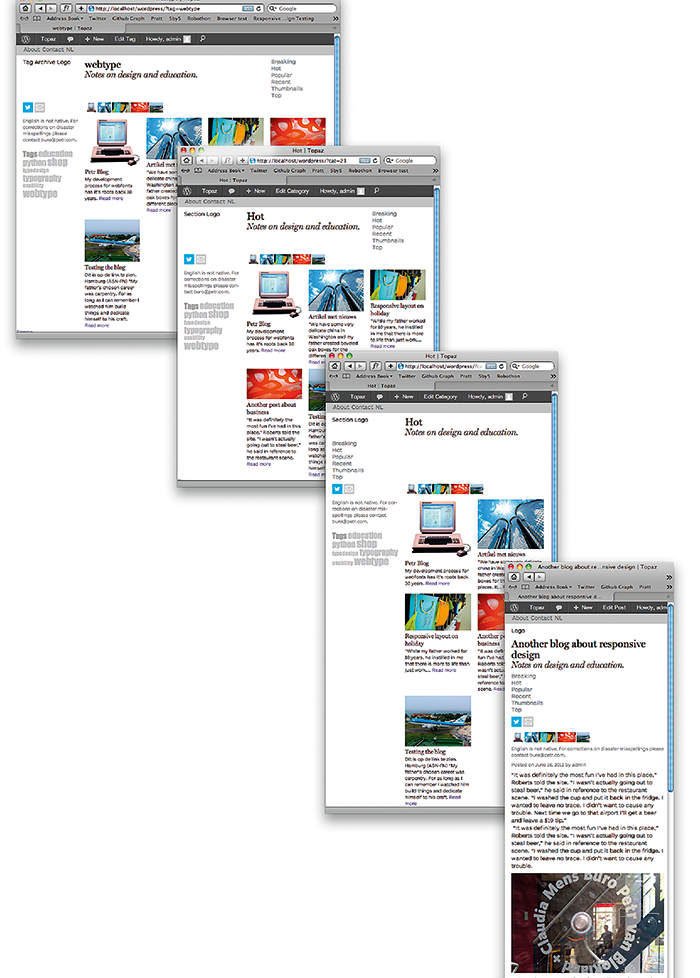
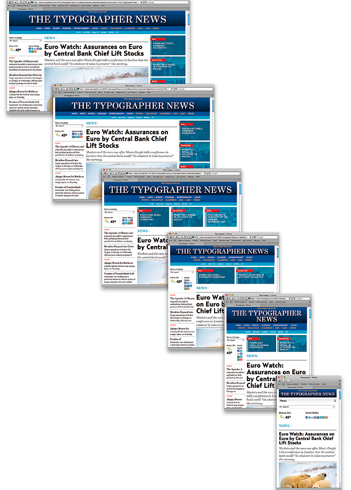
With the emergence of interactive media the page format is no longer fixed. A reader can use a tablet horizontally or vertically, a window can be scaled interactively and the various kinds of media have different screen formats. The designer no longer knows how wide the page is, which is why an optimal 

depiction of the design must be possible for every size. This technique makes use of what in 2011 came to be called a ‘responsive layout’. The layout information is built into the page code. If the size of the screen is changed (by rotating the tablet or by enlarging or reducing a window), the page is able to calculate the new layout. This results in an entirely different design process. Now the designer must think more in terms of storyboards than of static layouts. Storyboards involve a sequence that runs from large to small: from desktop PCs through tablets to mobile applications. In order to design a typographic system, the designer must be familiar with both the tools and the materials. What are the basic problems? To what surfaces is the typography being applied? Under what conditions is it being read? And how is the design being transmitted to the people who are executing it? Here we are faced with typography’s basic values, which show that as soon as you start digging a little deeper than the specification of typeface and size, you reach areas that are extraordinarily complex.
In the discussion of the future of typography, you often hear it said that the days of reading are numbered. The argument is that a picture is worth more than a thousand words. But we need text to describe the things we’re not yet able to show pictorially. Throughout history, regular attempts have been made to depict every aspect of our lives in pictograms. Yet there are many concepts that are impossible to convey accurately in pictures, especially if they refer to non-physical objects or actions such as “concept,” “impossible,” or “accurately.” In such cases, the correct interpretation of the image is completely dependent on context. Make a random switch of captions in a newspaper and a whole new world of pictorial meaning arises. We’re talking here about the essence of typography as the bearer of meaning.
Basic typographic values
According to Gerrit Noordzij, typography is “writing with prefabricated letters.” He’s referring to the age when type was set with a composing stick or to the context of Linotype, in which not letters but matrices are set and are then cast in lead as fixed lines of type. In the history of typography it’s clear where everything comes from: type size is the measurable height of the cast metal sort (regardless of the size of the letter shown on the sort); leading, or line spacing, is the amount of white added between the lines; and the shape of the letters is made to conform to the exact size at which they will be used so they appear optically uniform to the reader. Typography (as a system) refers to the values whose material basis can be found in the history of typography and printing technology.
Type size
When you see the face of a letter on film or printed on paper, it’s impossible to tell what the original type size was by measuring it: the lead measurement no longer exists. The best definition of “type size” might be the measurement of a character “a bit above the ascender and a bit below the descender,” so that the descenders from one line of body text come close to but do not touch the ascenders in the next line. This is fairly imprecise and fails to do justice to what can actually be seen. In a text, the x-height of the letter is more important than the height of the original lead sort. But the problem is that measuring the x-height gives no indication of the minimum line spacing needed to prevent the ascenders and descenders from touching each other. And it really gets tricky if the text is set entirely in capitals because the x-height isn’t even visible. The idea that “size 12” applied to any random typeface might indicate something about the readability of a text is still complicated. It all depends on the unit of measurement the software uses: points, pixels or millimetres. So type size is a relative measurement, only to be used when comparing different sizes of the same typeface.
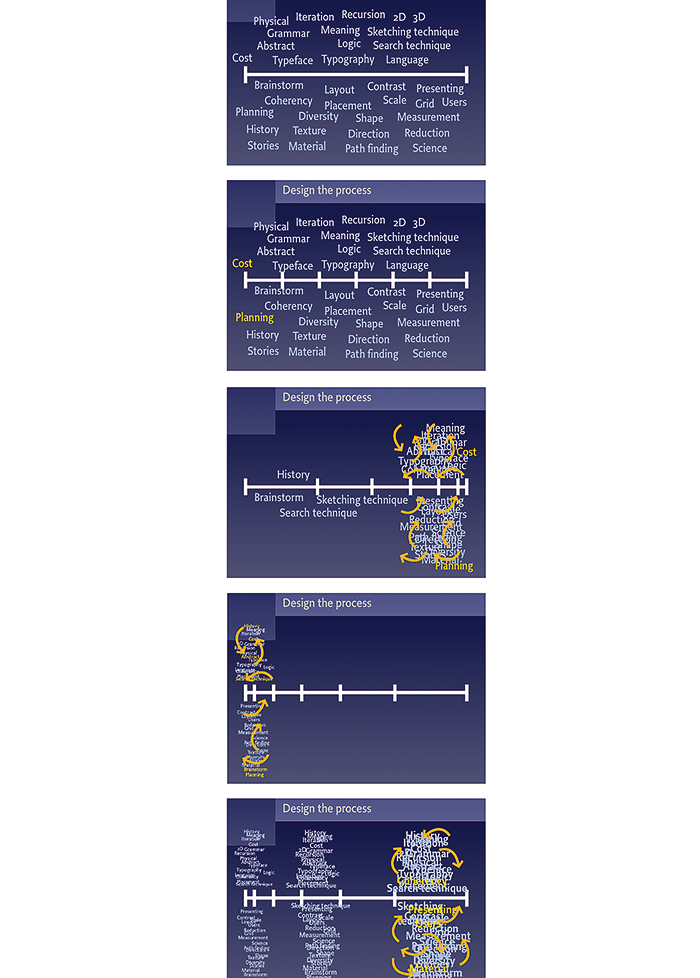
Typography, which is part of almost every graphic design process (1), poses a particular dilemma for the designer: the costs and planning must be determined beforehand, even though they cannot be known until afterwards. Because it is difficult to oversee the process in its entirety, a linear division of time is often used (2). But this solution is not feasible by definition. Indeed, if the process could be predicted with precision it wouldn’t be a design assignment but a production assignment. The result is that most of the work involved in a project—regardless of the total time involved—takes place during the last week (3). So the most experience with regard to the solution is accumulated at the end, when there’s no more time to make structural adjustments in response to progressive insight. For this reason, it’s better to turn the process around and to walk through the whole process as a scale model (4). A one-hour sketch phase produces more, relatively speaking, than a sketch phase lasting a week. By repeating these cycles several times—with ever-increasing detail and focus—the consequences of design decisions can be identified at an early stage (5). A provisional final presentation is available in every phase.
Line spacing
We run into the same lack of clarity when it comes to the distance between lines of text, as we see in the different concepts that have been developed over time: leading and line spacing. The problem is that no one knows exactly what these concepts indicate. The old term “leading” comes from the practice of adding white space between the lead lines. So a text set as 12/13 (“twelve on thirteen”) has a type size of 12 points with 1 point of leading. It’s all about the addition to the type size, not the actual distance from line to line. The optical distance between the lines is determined to a great extent by the length of the ascenders and descenders, the height of the capitals and the x-height. Deciding on the unit of measurement (didot points or picas) is still an open question. In digital applications the “em" or “rem” type size is being used more and more, which immediately incorporates the line spacing in adjustments to the size. In this light, it is striking that everyone slavishly follows InDesign’s method of specification, in which the line spacing is measured in points while the other measurements are expressed vertically in millimetres. Unavoidably, the fixed pictorial elements on a page don’t always align with the height of a text. Because of the lack of know-how, a lot of typography is still being done manually and is not being designed according to any typographic system.
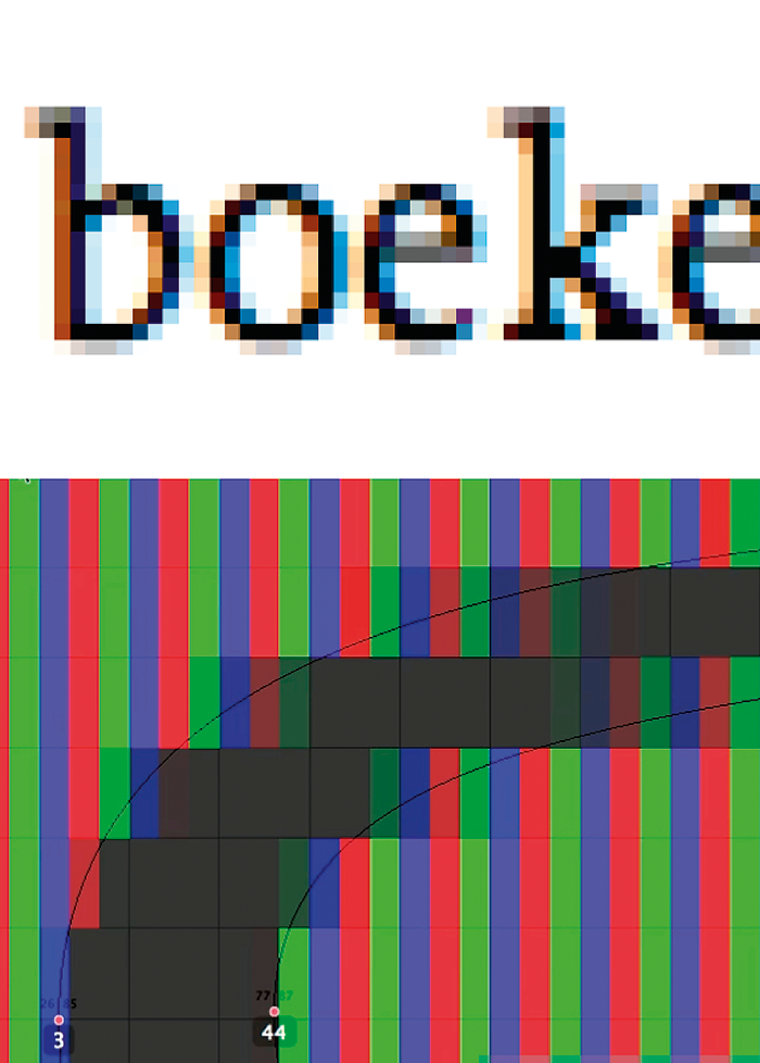
It is essential to know how letters are depicted on the screen in order to understand where the coloured pixels (1) come from in enlarged screen prints. The colours don’t really exist. They arise from the use of “subpixels.” By giving a pixel a particular color on the edges of a letter (red on the left and blue on the right), it is possible to increase the horizontal resolution by a factor of three. But only a screen pixel has this possibility, and it only works if the red-green-blue subpixels are vertical and rectangular (2). It’s different in the case of the Apple Retina Display because the text can be depicted both horizontally and vertically. The typographic designer must be aware of this during the design process as well as in the choice of typefaces.

It is essential to know how letters are depicted on the screen in order to understand where the coloured pixels (1) come from in enlarged screen prints. The colours don’t really exist. They arise from the use of “subpixels.” By giving a pixel a particular color on the edges of a letter (red on the left and blue on the right), it is possible to increase the horizontal resolution by a factor of three. But only a screen pixel has this possibility, and it only works if the red-green-blue subpixels are vertical and rectangular (2). It’s different in the case of the Apple Retina Display because the text can be depicted both horizontally and vertically. The typographic designer must be aware of this during the design process as well as in the choice of typefaces.
Typeface
The choice of a typeface also requires knowledge that goes beyond an intuitive preference for serif or sans serif. There are tens of thousands of typefaces, but the choice can be reduced to a handful of options on the basis of carefully considered criteria. It would lead us too far afield here to discuss all the aspects involved. Considerations such as application in body text or as display type; the relative proportion between ascenders, descenders, capitals and x-height; the availability of a genuine italic, small caps, or the use of the face on a screen, in various media with various applications—none of these will be dealt with here. Instead I will limit myself to the following main points.
Weights and breadths
How many weights and breadths are available and how are they distributed? How were the drawings made? Were they taken from “masters” (important for the construction of drawing sets)? Were the extremes drawn separately, so that in the case of very condensed and bold $ signs, for instance, the vertical line doesn’t run all the way through and the inner forms don’t disappear? What about the middle weights, which, after all, are the most widely used?
 When there is an appreciable difference between thick and thin strokes in a letter, we say it is a high-contrast typeface. Take the letter V, for example. The stroke on the left is very thick and the one on the right extremely thin, resulting in a letter that is asymmetrical, with a right side that is barely visible. To emphasise the optical existence of the right-hand stroke, the upper edge is often closed off with a horizontal line, a serif. This suggests that high-contrast letters often have serifs, since without them the typeface would be irregular and the letters more difficult to recognize.
 When there is an appreciable difference between thick and thin strokes in a letter, we say it is a high-contrast typeface. Take the letter V, for example. The stroke on the left is very thick and the one on the right extremely thin, resulting in a letter that is asymmetrical, with a right side that is barely visible. To emphasise the optical existence of the right-hand stroke, the upper edge is often closed off with a horizontal line, a serif. This suggests that high-contrast letters often have serifs, since without them the typeface would be irregular and the letters more difficult to recognize.
Contrast
The contrast in a typeface is an important consideration. The thick-thin distribution in a letter can reinforce its visual relationship to other elements on a page. Is the construction asymmetrical (related to writing with a broad-nib pen) or symmetrical (related to using a fine-nib pen)? Another aspect is the ratio between the thinnest and the thickest parts of a letter. If the difference is large, the letter has a great deal of contrast and cannot be used in very small sizes. A letter with contrast also usually has serifs. The opposite is also true. A typeface with little difference between thick and thin is usually sans serif. It’s rare to find low-contrast letters that have serifs, certainly as body type. So choosing a serif or sans serif letter has its consequences. The difference in contrast will have an immediate effect on the use of the typeface in extreme circumstances, such as in applications involving very small text on a screen or a light box. Clearly the desired contrast of the letter should be determined first, and the choice of serif or sans serif typeface should be based on that decision.
Completeness of the symbol set
Also important in choosing a typeface are the scale and diversity of the symbols—glyphs. In applications in several languages—as in the case of house styles—all the symbols and accents of a language must be available. This is far from true with every typeface. The numbers in particular deserve special attention. System typography needs different kinds of number series, depending on their application. If the numbers in a font have the same height as the capital letters they attract extra attention, even though that is usually not the intention. The use of “old-style” or “mediaeval” numbers provides the desired proportion between numerical forms and letterforms in a text. It also prevents a number such as 32123 from having a hole in the middle. “Titling figures,” which are equally spaced, are used in tables in which the numbers are meant to be added up. Titling figures have the same visual height and base line, which prevents a number such as 56 from appearing slanted.
The problem is that many designers don’t know what the unit of measurement of this corrective number is. In the Adobe series it’s 1/1000 EM, and with Quark XPress it’s something else. The value is often determined by feel, depending on the application, the type size and the typeface.
Spacing and kerning
The white space in a typeface may be even more important than the black. Most studies on readability and the recognition of letterforms in a word only look at the black, while the white spaces are the most crucial. Three factors together determine the consistency of the white space:
• first the white—left and right—that is particular to every letterform;
• second, the white that results from optical correction—“kerning”—which the letter designer applies to pairs of letters (AA en VV can’t be any tighter, while AV and VA require optical correction);
• finally, the white that is added to the spacing of an entire text (such as by setting a small type size at +4).
The problem is that many designers don’t know what the unit of measurement of this corrective number is. In the Adobe series it’s 1/1000 EM, and with Quark XPress it’s something else. The value is often determined by feel, depending on the application, the type size and the typeface.
Line length
The length of a line of text encloses the frame with the most important typographical values. Decisive factors are the number of characters in a line and the number of word spaces. If a text is justified and there are few word spaces, then there’s less room for dividing up the white. So narrow columns tend to have more holes than wide columns. The language is also important. A German text uses longer words and fewer word spaces on average than an English text. The way words are broken is also important. The optimum number of characters in a line is between 60 and 80, but it’s the width of the type design, the average letter frequency and the size of the type being used that determine what line length is thereby produced.
Finally: Layout
In terms of complexity, the layout of a text exceeds the application of typographic values. The number of possible ways that the various elements can be arranged on a page is infinite. Designers are able to reduce this to a limited number of possibilities by regarding comparable solutions as a single option. Checking details is something that every designer must master or he won’t be able to design “the big picture.” Every layout has an intrinsic hierarchy. There are certain elements that the reader must see first, and others that are at the second level. The visual grammar of the page and the graphic coherence of the elements contribute to the structuring of the contents. Even if the designer consciously departs from this, the result still has a visual hierarchy. In that case, however, it’s more difficult to predict with any accuracy how a reader is going to interpret the contents.
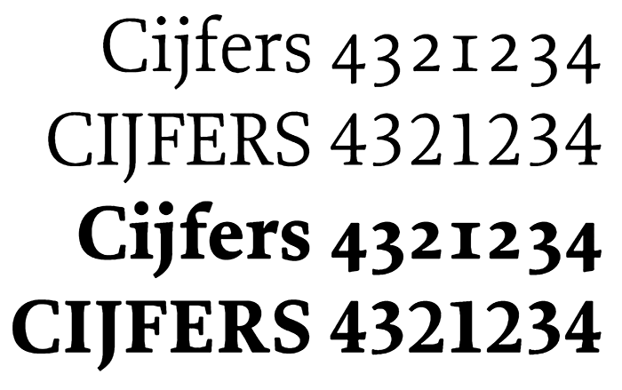
In typography with numbers, a typeface must satisfy so many different requirements that some designs have several series of numbers. Even here, there is the question of available weights: if a number in a table is emphasised through the use of a bolder weight, the rest numbers in the columns still have to align so they can be properly tallied. That means that—regardless of their weight—all number must have the same width, which contradicts the optimal spacing of the characters by weight (the bold numbers will be too close together and the light ones too far apart). In addition, we don’t want a number like 4321234 to have a hole in the middle because the number 1 is the same width as the other numbers. This problem does not occur in texts: there every form, whether it’s a letter or a number, has the width and the white space it needs. The kind of numbers used in texts is called "mediaeval."
In short: with large and complex design projects the typographical designer must possess extensive knowledge of the tools and materials that together form the basic values for using typography as a system. These are elementary values, rules and basic principles of typography which have a long tradition that, despite fundamental social and technological change, are still valid today.
++++
The Triumph of Typography is edited by publisher Henk Hoeks and design critic Ewan Lentjes, and includes contributions from: Peter Bil'ak, Petr van Blokland, Hans Rudolf Bosshard, Paul van Capelleveen, Roger Chartier, Paul Dijstelberge, Yuri Engelhardt, Willem Frijhoff, Christof Gassner, Michael Giesecke, Britt Grootes, Gerard Hadders, Henk Hoeks, Ralf de Jong, Ewan Lentjes, Ellen Lupton, Lev Manovich, Jack Post, Rick Poynor, José Teunissen, Wouter Weijers. The book is designed by Patrick Coppens, and published by TERRA with ArtEZ Press. It can be purchased here.
