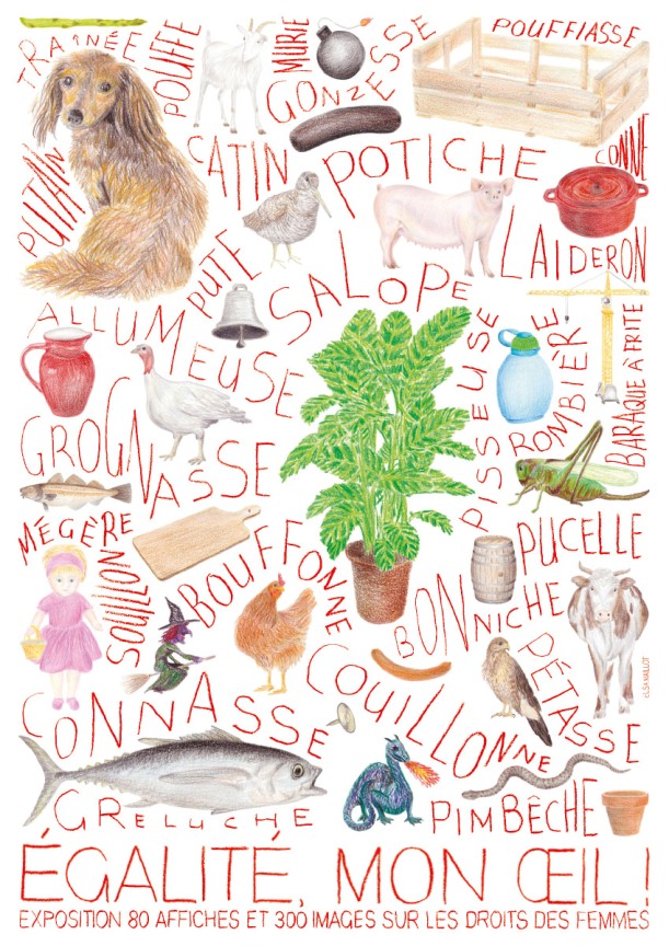
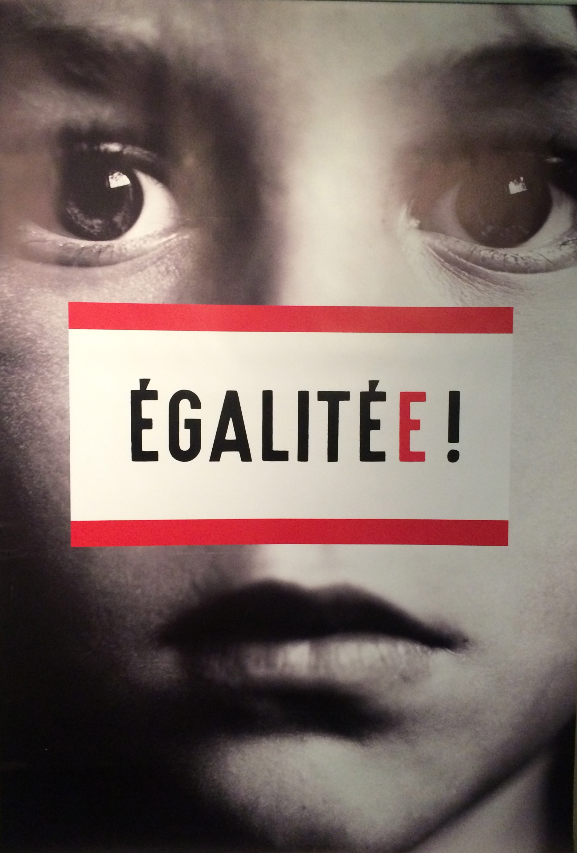
Poster for Egalité, Mon Œil!, Elsa Maillot, 2016
For some reason, sexist slurs cling to women the way Polystyrene peanuts cling to garments. Babe, chick, cunt, ditz, doll, dish, floozie, gal, hussy, sex kitten, tart, tramp, vamp, and what’s-her-face. As electrically-charged as petroleum-based packing material, the offensive comments get into every crack and crevice of a woman’s psyche.
This weird phenomenon is the topic of Egalité, Mon Œil! (Equality, My Ass!), a recent exhibition in Paris that features a selection of international posters dealing with feminist issues, including reproductive rights, pay discrepancy, and spousal abuse. The invitation poster lists about thirty disparaging expressions—conne, pétasse, gonzesse—which make up the new wave of French slang words that are derogatory toward women.
Held in the curvy subterranean lobby of the Communist Party Headquarters, a handsome modernist landmark designed by Oscar Niemeyer in the 1970s, the graphic work on display feels like a time capsule. The gallery space is wrapped around the domed auditorium, a vast glittering UFO chamber. It is a disquieting environment to view images that document the last forty years of the feminist struggle. That was then, this is now.
It is a show about women, but men have designed more than half of the selected posters. Optimists, like myself, would like to see in this co-habitation of talents evidence that the Y chromosome does not necessarily determine phallocentric tendencies. But cynics might have a point when they argue that this is yet another example of how men can’t help but dominate the conversation, whatever the topic.
Well, exactly. The female anatomy, that was, incidentally, such a great source of inspiration for Niemeyer, is the visual catalyst of most images in this show. Breasts, lips, thighs and eyelashes are favorite tropes. Women are represented by the sum of their parts. From posters by the French collective Nous Travaillons Ensemble, to more recent ones by the likes of Michel Bouvet or Christophe Gaudard, the visuals are sexually suggestive, even though their intent is to denounce the sexist attitudes that objectify women.
To my great disappointment, a number of women designers are borrowing the same demeaning motifs in their posters, having internalized the language of oppression as the norm. The equivalent of verbal sexist slurs, graphic representations of female crotches and nipples are sticky metaphors that, willy-nilly, define our standards of femininity.
This show is evidence that the graphic language may no longer be the best way to serve the cause of women. Are violent, anti-war films serving the cause of peace, or are they glamorizing the brutality that they are supposed to condemn? You can’t fight old stereotypes with new stereotypes. We need a new conversation. Not one about women’s bodies (enough already!), but one about women’s brains—probably their most formidable physical attribute.
Design Observer readers who speak French might want to read about the exhibition on the French Communist Party's website, and it is interesting to note that the Grapus image below has been censored on Facebook.
Design Observer readers who speak French might want to read about the exhibition on the French Communist Party's website, and it is interesting to note that the Grapus image below has been censored on Facebook.
++++
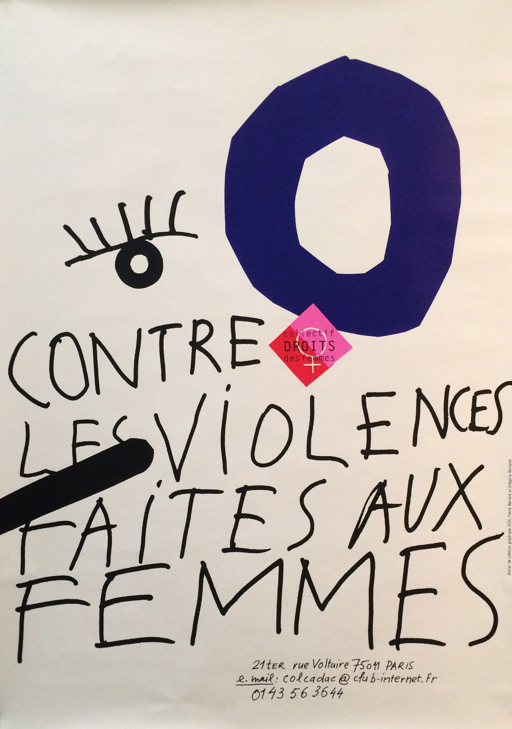
Atelier de Création Graphique, 2005
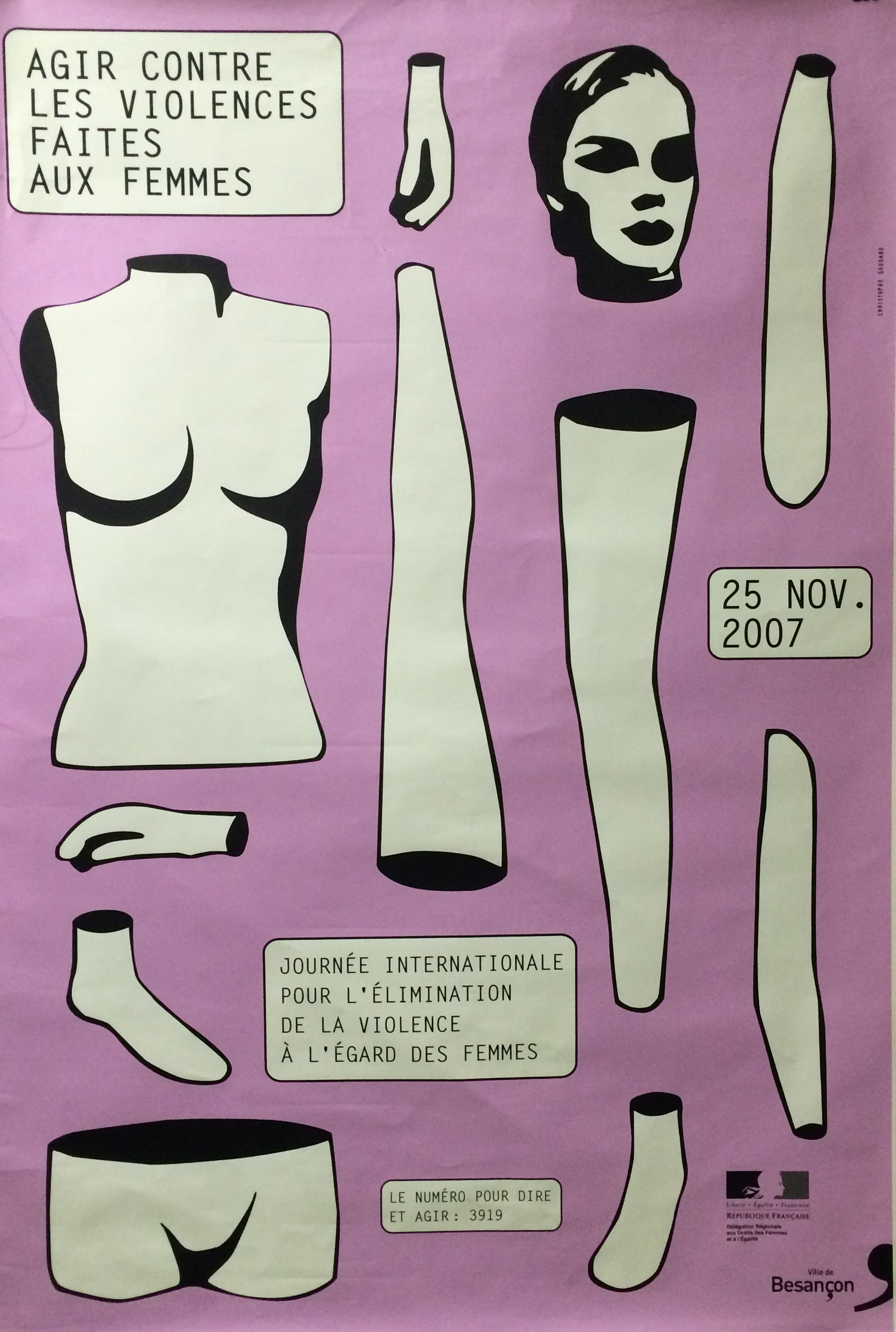

Christophe Gaudard, 2007
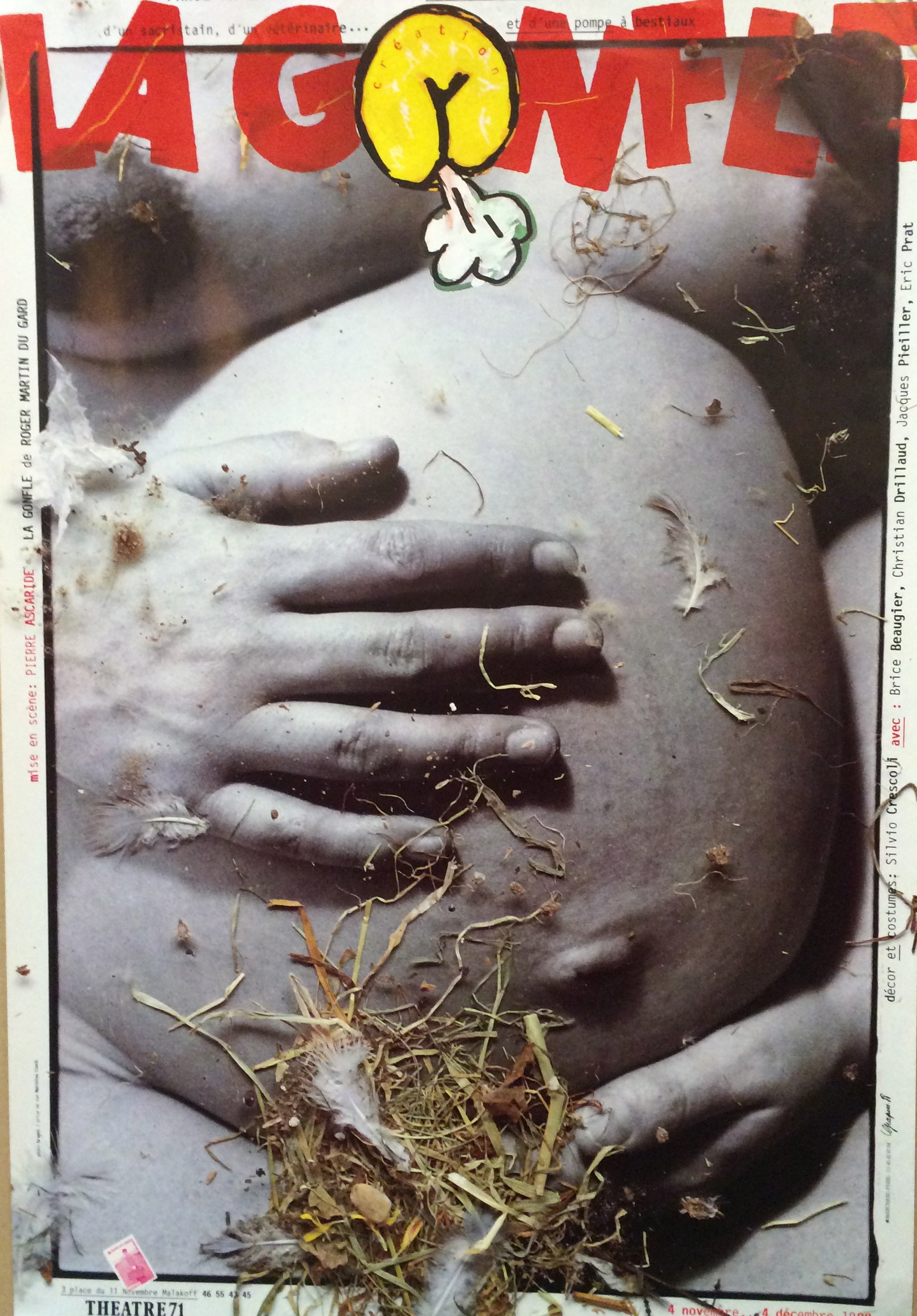

Grapus, 1988
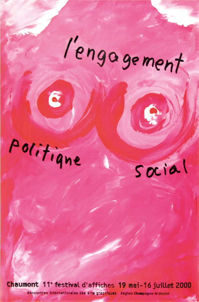
Nous Travaillons Ensemble, 2000
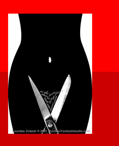
Lourdes Zolezzi, 2001
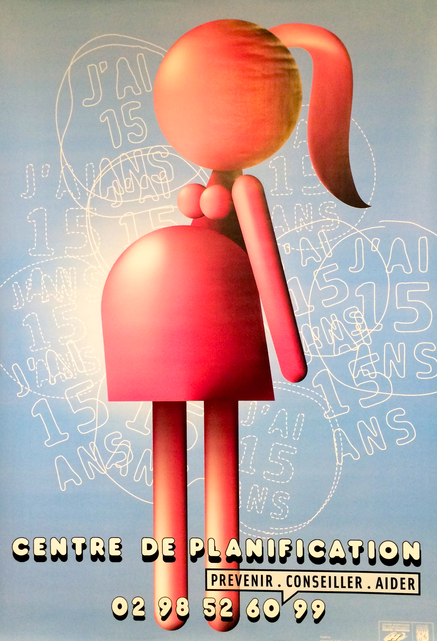
Carolinas Rojas, 2008
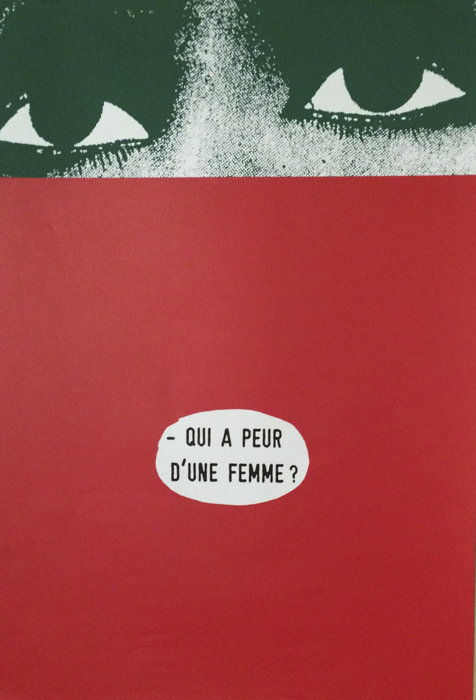
Gérard Paris-Clavel, 1999

Gérard Paris-Clavel, 2012
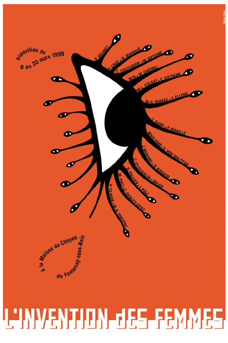
Muriel Paris, 1999
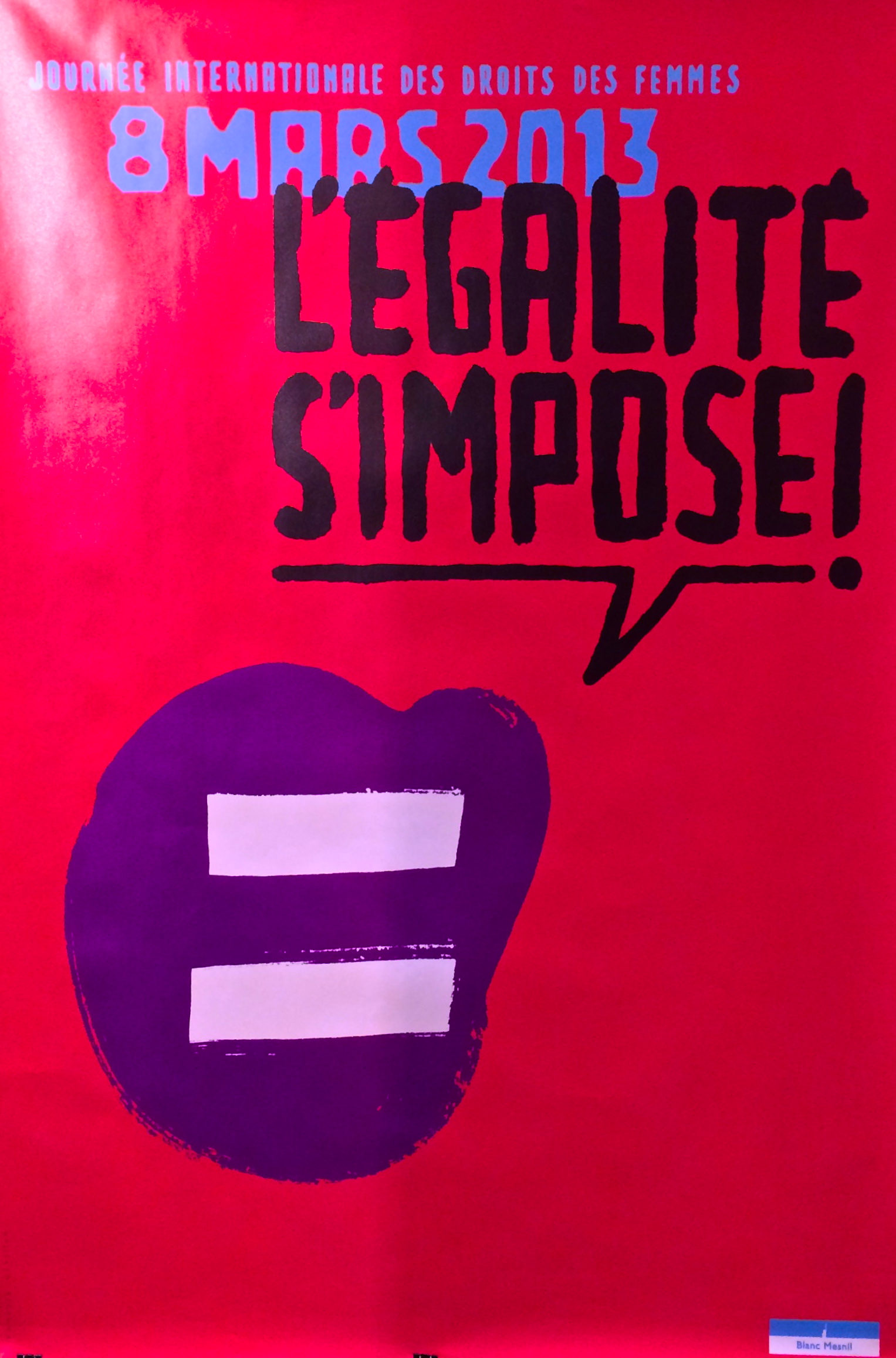
Vanessa Vérillon, 2008


Comments [1]
03.08.16
04:40