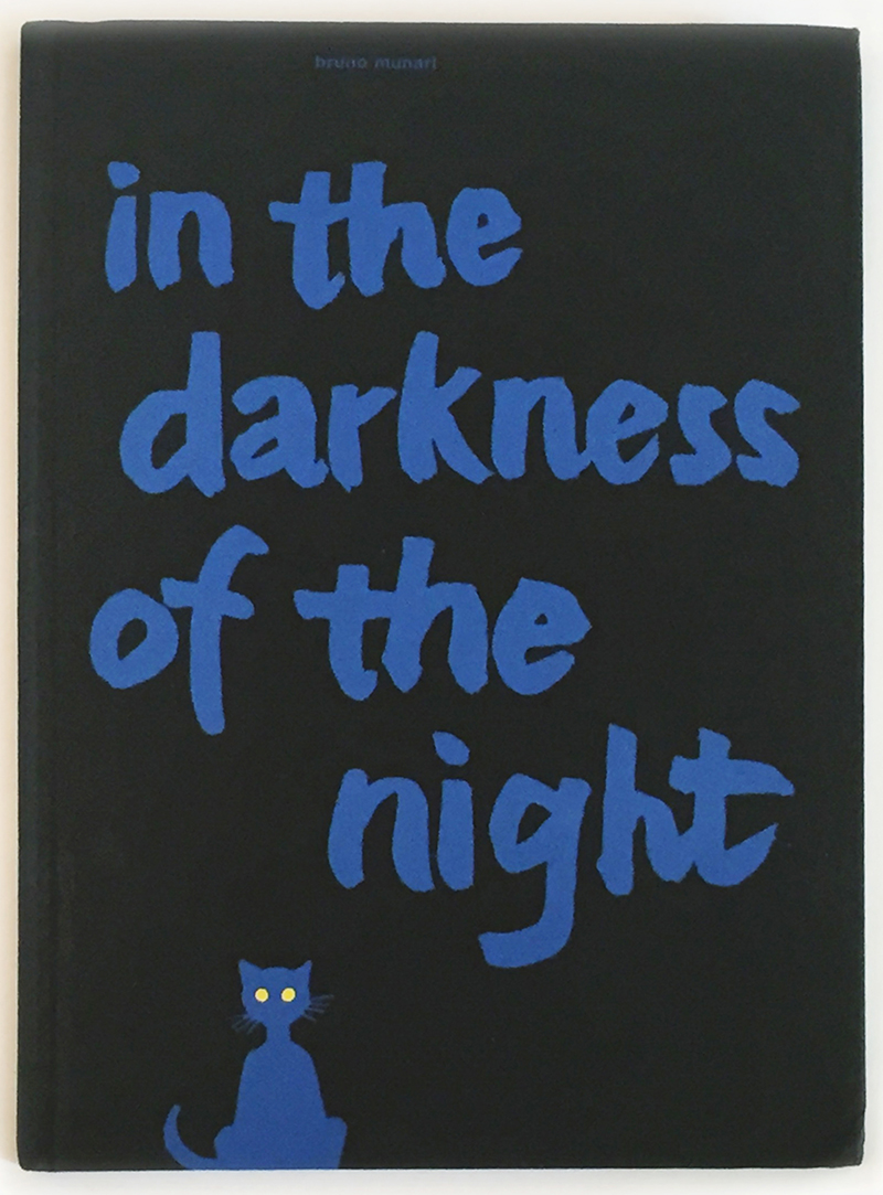
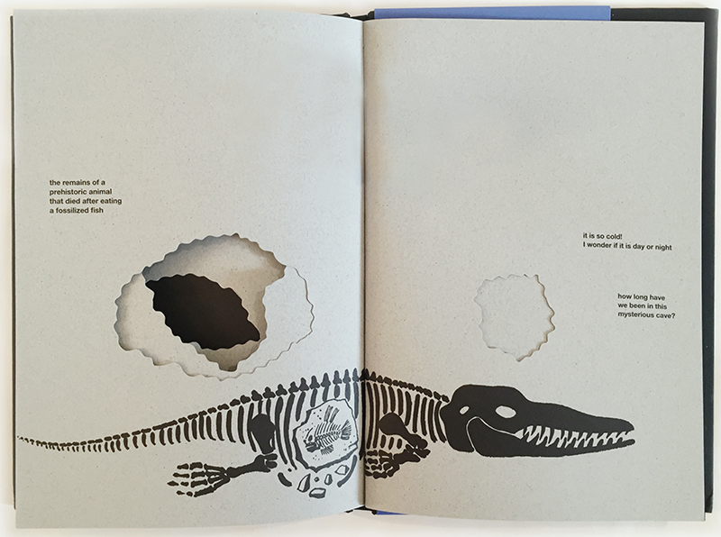
As a slim, bound collection of paper and ink, words and graphics, In the Darkness of the Night is certainly a book, but can hardly be called a story. Without a plot, dialogue, or character development, the assemblage is more like a continuous sampling of scenes, and the narration resembles tweets from a road trip. The smattering of words range from phrases as simple as “far away” to those as convoluted as “the remains of a prehistoric animal that died after eating a fossilized fish.” Off-the-wall rhetorical questions like “how long have we been in this mysterious cave?” pop up without rhyme or any apparent reason. Mostly, the text develops setting.
But for Bruno Munari, artist, designer, and inventor, setting was a serious matter. For much of his career, Munari constructed his pieces with time and place (the core definition of setting) as if they were materials, purposely treating these elements as critical components of an entire design. His boldly symbolic “Useless Machines” operated with time and space, rather than merely in time and space.
Perhaps it is with his fascination for this one element of stories—setting—that Munari created a picture book that speaks of him and for him: In the Darkness of the Night. He drew upon all the possibilities of a book (typography, illustrations, physical materials) to build a communication device that says more than words do. Where Munari denies us a compelling plot, he crafted a window to his perspectives on design and art.
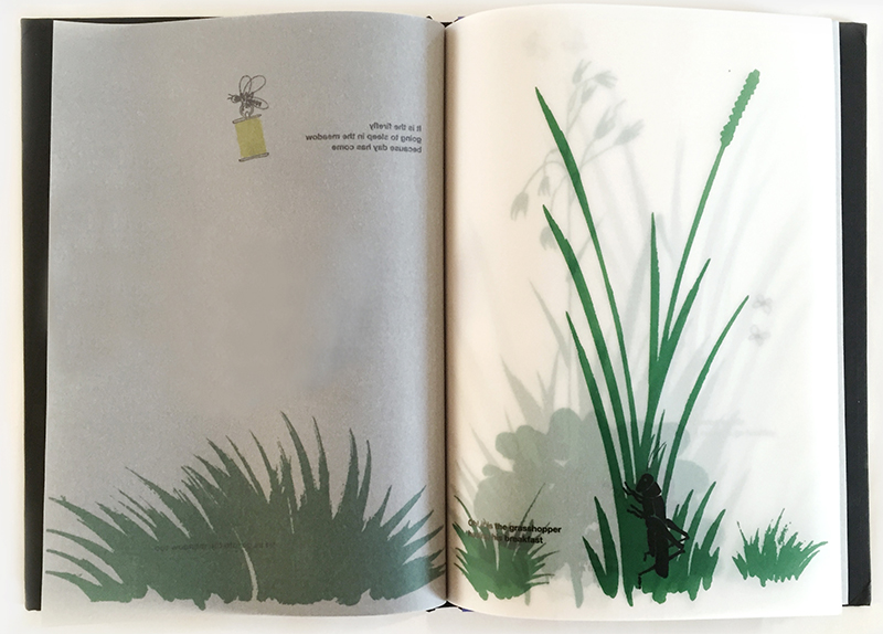
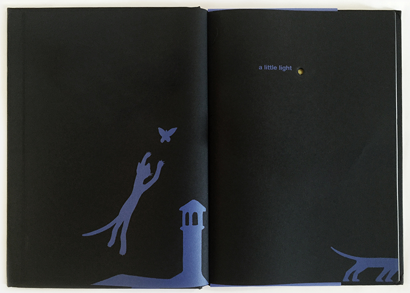
In In the Darkness of the Night, time and space are shaped not only by the text’s literal meaning, but also by Munari’s typographic choices. The typography paces the reading experience with its unpredictability. By not appearing on every page (and inconsistently positioned when present), the text is enough of a surprise that the reader intuitively slows down to notice when it appears and draws parallels between its literal meaning and the meaning in context of the graphics. Set distinctively smaller than usual for picture books, the text demands scrutiny. And although each page holds ample white space, Munari insists on placing the tiny text in places atypical to picture books—crammed in a corner, for example, or overlaid on an image of grass. The text becomes as much part of the scene as the graphics, and its relative obscurity offers a sense of private discovery to the reader—as if we are finding hidden notes on a treasure hunt. Thus, rather than complying with the expectation of picture books to be unmistakably legible and reliably populated with text, Munari instead combines graphics and words to invite a closer, more intimate exploration of the worlds he made.
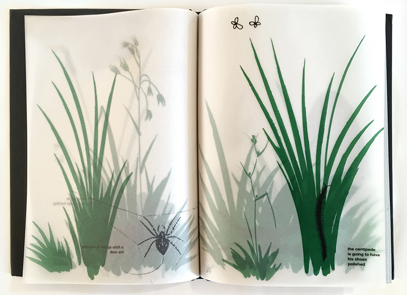
Being the design polyglot that he was, Munari doesn’t stop there. He also communicates setting through carefully selected materials that construct the book itself. Unlike his other picture books (such as Bruno Munari’s Zoo and Bruno Munari’s ABC), In the Darkness of the Night is made with materials that build mystery and tension—fragile, transparent papers veil certain scenes and crisp diecuts create peepholes through thicker pages. At times accelerating the reader’s progress and at times retarding it, and the resulting curation of pace and space becomes both a highly tactile and visual experience. And, with the pacing of the words inevitably evoking an auditory experience, Munari’s book is one that speaks to the senses and provokes curiosity.
Of course, In the Darkness of the Night was not Munari’s only innovative or “counterculture” book. His “Unreadable Books” made a clear statement for books to be considered as objects that hold meaning and experiences beyond the words printed in them. But the sentiment behind this reached far beyond books. In Design as Art, Munari wrote, “What really counts is the information which a work of art can convey, and to get down to this we have to abandon all our preconceived notions and make a new object that will get its message across by using the tools of our own time.”
In the Darkness of the Night is an example of such a new object. First published by Muggiani as Nella Notte Buia in 1956, In the Darkness of the Night is now be widely available in English from Princeton Architectural Press. Of course, one might ask: If Munari designed books as objects with meaning beyond the words they contain, does a translation matter? The answer is undeniably apparent between the covers of this edition—even if the story isn’t dominant, a translation exchanges one set of graphical symbols to another set that we can discover, decipher, be guided by, and explore.

