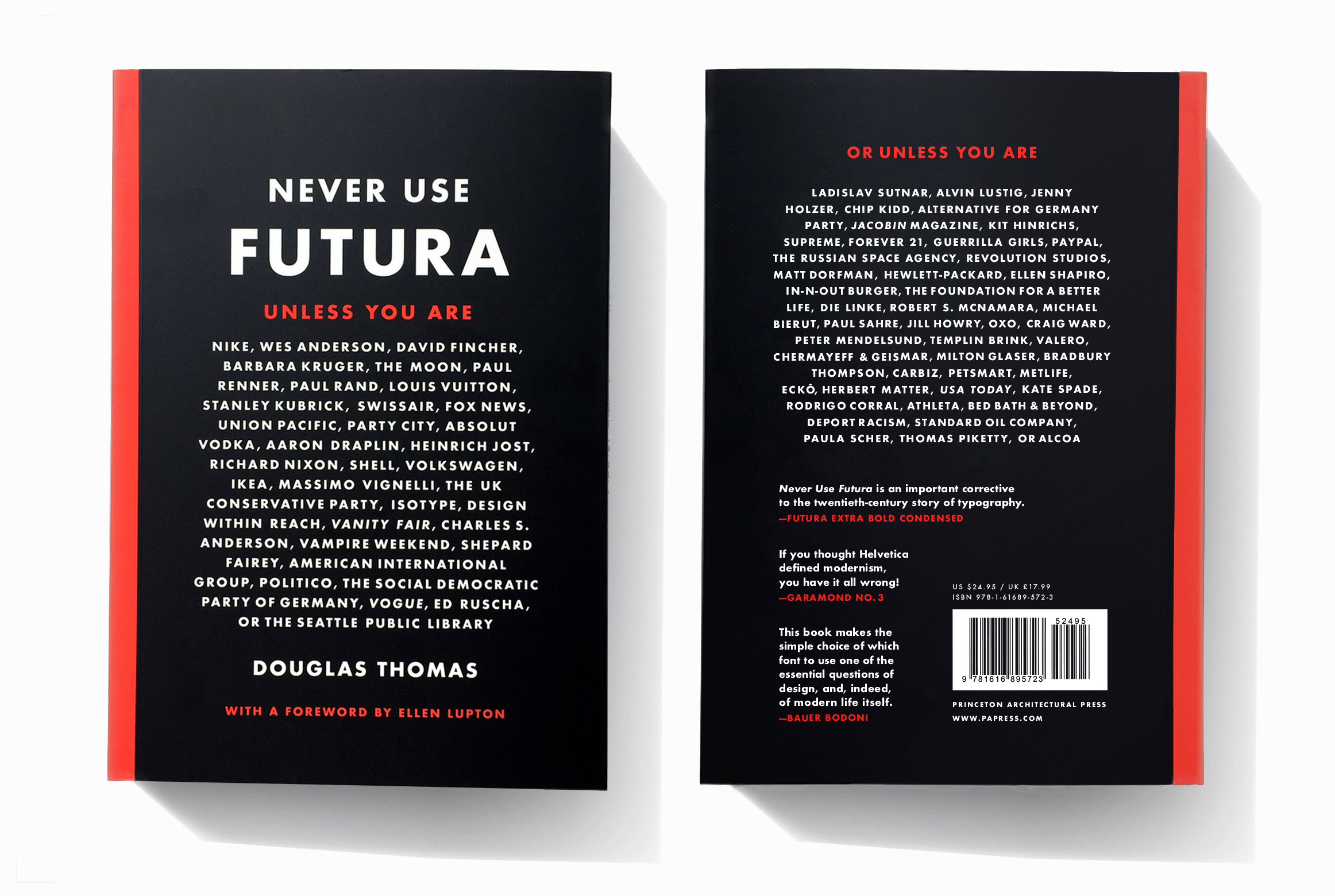
It could have been Never Use Comic Sans. Or Never Use Arial. Or—dare I write it?—Never Use Helvetica. Instead, Douglas Thomas chose Futura.
An entire book on one font can seemingly appeal to only one “type”: a true type nerd. And yet, like the hit documentary Helvetica, this book goes far beyond a myopic view of a typeface’s construction and explores how a typeface has shaped and was shaped by our culture and society. Never Use Futura traces and deconstructs the layout of the page on which Futura sits: our world.
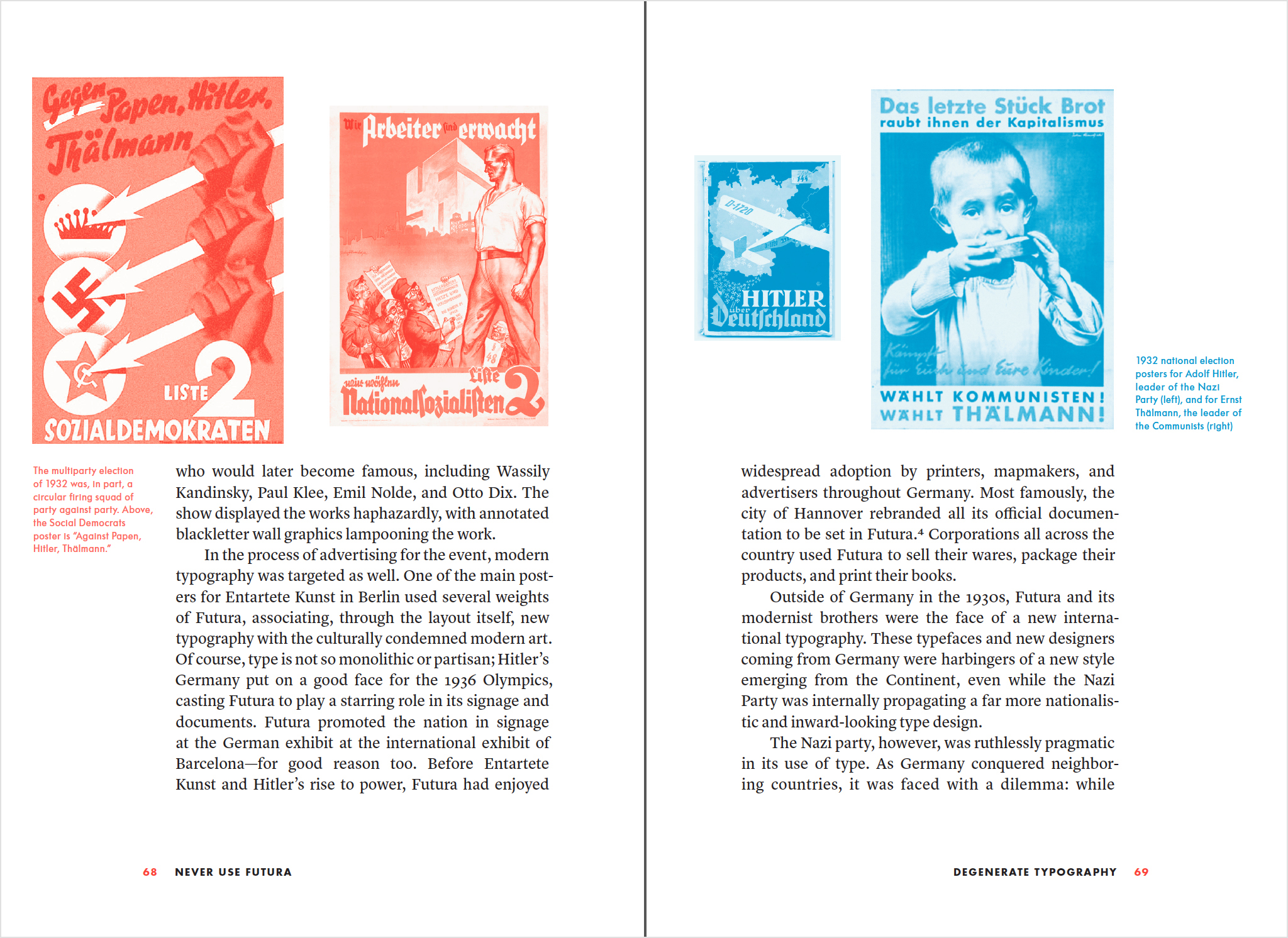
Author Douglas Thomas makes clear that, despite its simple lines, the typeface is anything but simple. Designed by Paul Renner in 1920s Germany, Futura entered the world at a time when “typefaces were on the front lines of culture” and was quickly swept into a maelstrom of political turmoil. With Hitler’s rise, the Bauhaus closed, Renner was arrested (as well as Jan Tschichold and many others), and modern art was generally deemed insulting and impure. In "Entartete Kunst" (Degenerate Art), the Nazi Party’s exhibition to shame modern art, Futura appeared in prominent posters, contrasting starkly with the blackletter faces that were commonly used. Yet, the Nazi Party later abruptly switched to using Roman typefaces, including Futura, claiming that blackletter faces had Jewish origins..
By this time, Futura had landed a spot on type boycott posters distributed in the United States—in the “Nazi-type” column. Faces made in the U.S. were promoted as alternatives. And there were numerous alternatives. Yet, as Thomas points out, it is mostly through this prolific imitation that Futura firmly established itself as a model for geometric sans serif type.
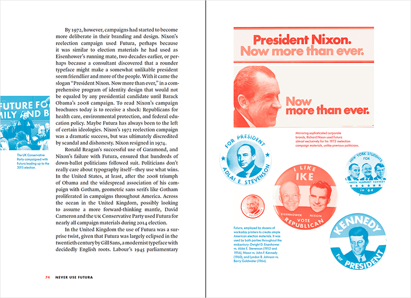
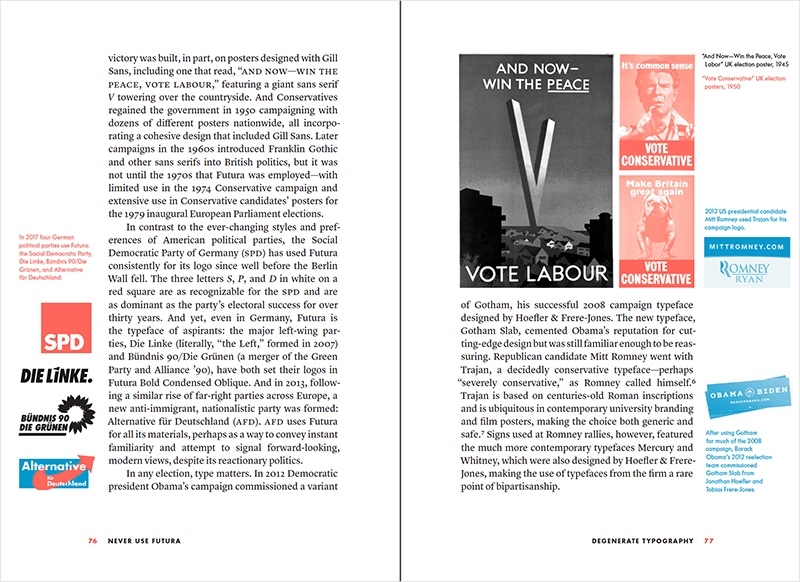
Despite the boycotts, Futura maintained widespread popularity in the U.S. After the turbulence of World War II had quieted, Futura was soon caught up in numerous U.S. political campaigns—representing both sides of the fence. Used at all scales, from buttons to posters, Futura had by this time become ubiquitous enough that it essentially felt non-partisan.
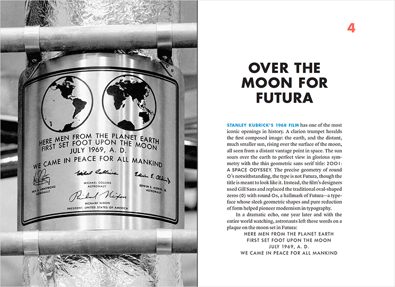
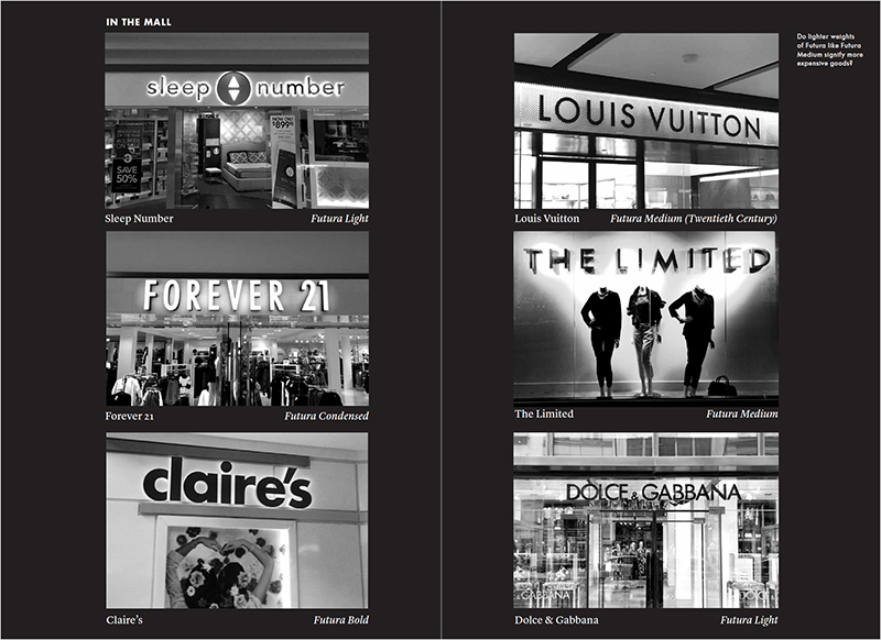
After providing meticulously researched historical context, Thomas then explores what ubiquity means for a typeface. With its clean lines and weights ranging from slim to strong, Futura (and its mimics) is a versatile choice for logotypes and advertisements, book and album covers, food packaging and people packaging (clothing). It is on crayons in the tight grip of a preschooler. It is on notebooks tucked in the shirt pockets of the everyman. It is emblazoned across storefronts all over the world, signaling for goods ranging from laptops to luggage, pizza to prom tiaras, dog toys to diesel, mattresses to makeup, and coffee to confetti. And, it sits quietly on a plaque installed on the Moon.
For Thomas, Futura is not simply a typeface. As Thomas puts it, “Futura is really more about a more far-reaching idea … It is an aesthetic idea about modernity—clean lines with a slight human touch, embodied in a name filled with hope.”
With a foreword by Ellen Lupton, Never Use Futura is neither a dense textbook nor an opinionated ramble on art history. It tells a smart, incisive story about the way one typeface became woven into our cultural sentiments and movements. New designers will start to notice Futura everywhere. Seasoned designers will see layers of meaning in Futura (and its look-alikes) everywhere.
In either case, Never Use Futura may change the way you see our world. And it almost certainly will change the way you use Futura. Which, with an important caveat, Thomas says you should do. “The key to choosing Futura is to make it your own. Know its history but challenge its past—keep it fresh; make it new.”
Correction: The original article described blackletter faces as being signature to Hitler's propaganda, when more likely, blackletter was used because of its popularity at the time. The article also stated that the Nazi Party discovered blackletter faces had Jewish origins, when more accurately, the Nazi Party made this claim about Jewish origins to support their decision for banning blackletter. The article has been updated for accuracy.

