On Thursday the AIGA will award Dan Friedman, among others, the AIGA Medal. This week we publish a remembrance of Dan by his friend Christopher Pullman. Read Part 1 here. Part two here.
++
The dichotomy between the rigid modernism of Ulm and Weingart’s playful experimentation at Basel accompanied Dan to Yale in 1969. These ideas were reflected in the projects he brought to the program: problems that typically involved the collision of two overlapping systems—the structured and the free; the conceptual and the intuitive; the modernist and the radical.
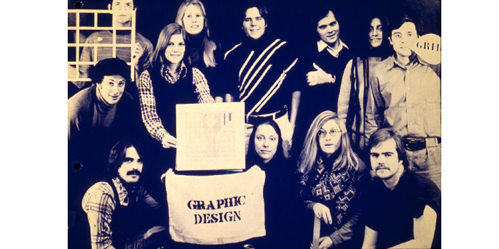
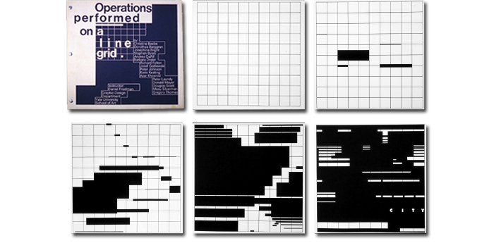
Dan was a good teacher, exotic and demanding. In one case he introduced a classic Basel formula, starting with a fixed grid on which he asked students to make a simple operation, then gradually expand the variant in a series of logical and clear steps until the new idea overwhelms the underlying grid. The last composition added the letters C, I, T, Y to contextualize the abstract formal ideas.

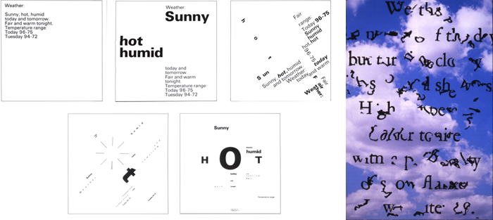
In another he started with a bland message—in this case, a weather report. He asked his students to experiment by gradually making the message dysfunctional, an odd idea in the modernist mindset. But it had to do with his notion that typography (and other kinds of visual messages) had two dimensions: legibility (Can I read it?) and readability (Am I interested in reading it?).
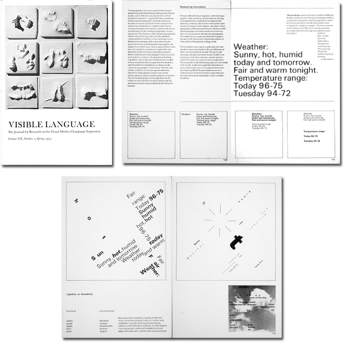
To paraphrase Dan: the goal of legibility is to optimize communication by making the message orderly, simple, static, even banal. This mode assumed the reader to be a relatively passive recipient. On the other hand, readability engages disorder, complexity, dynamism, originality (and I would add, wit), conditions that promote interest, pleasure, and a more active reader participation. Dan described these problems for graduate students as “advanced fundamentals” (simple but deep). He felt students needed a methodology for understanding contemporary typography, and he set about to codify one.
Dan was determined to create a methodology that would be seen as a foundation of, not a replacement for, personal expression. Typical of his intense, directed process of working, within a few years he had published his pedagogy and examples of his student work in Visible Language, one of the few critical design journals in the US at the time.
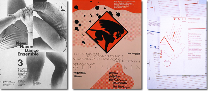
Dan not only affected Yale’s curriculum, he also practiced what he preached. In addition to turning out memorable work for local organizations, he also somehow convinced the Dean to employ his expressive typography on the school’s admissions materials, signaling that something new was up at Yale.
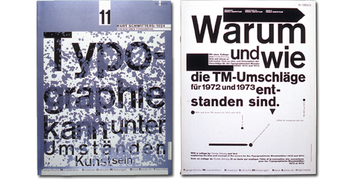
Meanwhile, Wolfgang Weingart, Dan’s former teacher in Basel, had also been perfecting his own experiments with a “new typography,” and around the end of 1971 we began to see issues of TM, the magazine of the Swiss typographic industry, with amazing covers that he had produced. They had a kind of energy and fascinating formal logic that felt invigorating and naughty.
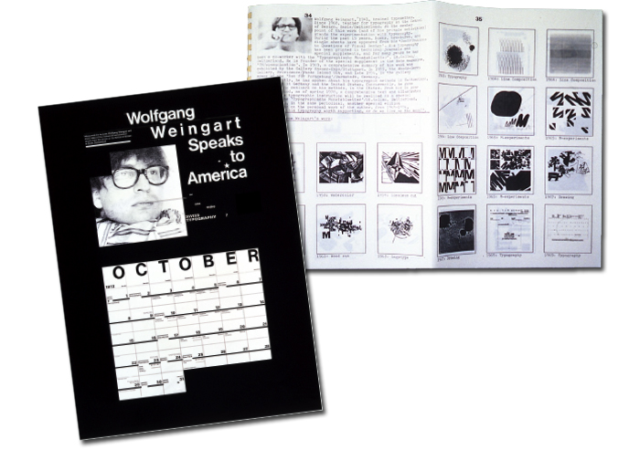
The next year Dan arranged for Weingart to tour the US. Lecturing at scores of schools, including Yale, he offered a carefully thought out alternative to the canons of high European modernist typography, amusingly titled “How One Makes Swiss Typography.” This trip suddenly turned Weingart into a cult figure and kickstarted student interest in his typographic experiments.
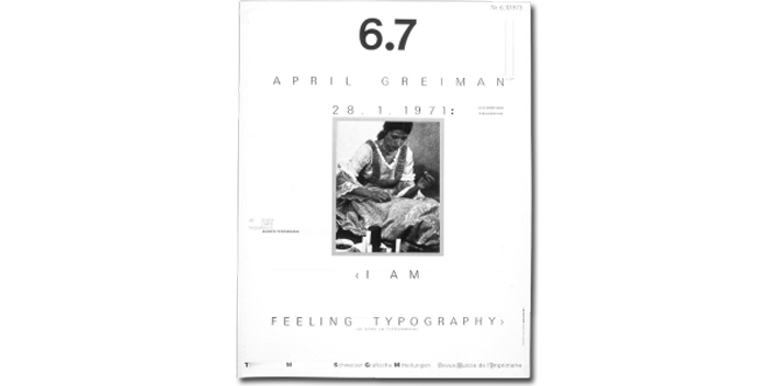
One of Weingart’s TM covers from 1972 featured a Basel pupil, named April Greiman, under the romantic and very Wolfgang-like headline: “I feel typography.”
Like Dan, April had been one of Wolfgang’s star students, and after graduation had landed at Philadelphia College of Art, now the University of the Arts, to take the place of a departing visiting faculty member who just happened to be Dan. They met, hit it off, and—not very long after—April was in New Haven, designing Dan’s moving announcement. Esther and I would visit them in their Branford, Connecticut, bungalow, which was filled with stuffed cloth boulders and painted rocks, the first inklings of his later domestic decor.

Dan and April were alike in many ways: incredibly gifted and ambitious missionaries of the new typography. While Dan was intellectual, methodical, and focused, April was intuitive, impulsive, and spiritual. Dan taught April about method and meaning; April taught Dan about designing from the heart. They married and began to collaborate on some notable projects.
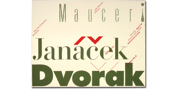
Asked in a 1994 interview about the connections between the two of them and Wolfgang, Dan replied: “We all influenced each other. We all had egos that were so large they became incompatible. Nonetheless, there were a lot of similarities in what we pursued.” Dan and April, inspired by Weingart’s pioneering work and with assists from other Basel graduates like Ken Hiebert and Willi Kuntz, led the way for a generation of “new wave” typographers and designers less steeped in the traditions of classical modernism and inspired by the changing culture in the 1970s and '80s to employ a more playful, surface-oriented formal language.
Their influence could be felt in the groundbreaking work of other designers following a similar path. Designers like Katherine and Michael McCoy at Cranbrook, their students Alan Hori and Scott Makala; and Nancy Skolos and Tom Wedell.
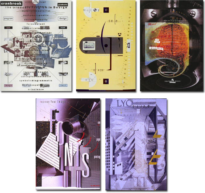
In their influential periodical Emigre, Zuzana Licko and Rudy VanderLans presented endless digital typographic innovations like the eccentric and off-kilter Template Gothic by Barry Deck.
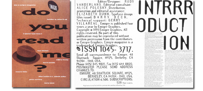
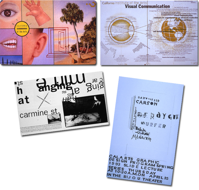
Jeff Keedy and Lorraine Wild began practicing in LA and spreading the word at Cal Arts. Eventually this gene pool begot David Carson and finally Ed Fella, the master of the artless vernacular, about as far from Basel and Ulm and the Bauhaus as you could get.
Part 4 tomorrow.
Grid study: Don Moyer
Weather Report: Rosalie Hansen Carlson

