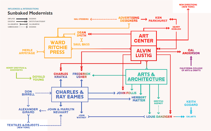
While there is always some truth in stereotypes—and the book abounds in the lightheartedness, effervescence, and optimism that signals "California" in the popular imagination—as the title suggests, Earthquakes, Mudslides, Fires & Riots also reveals how political shifts, sexism, and the environment also had an impact on the development of generations of designers who responded to California's unique cultural climate. Books on graphic design history abound; memorable movements and celebrated creators are well documented, but no book yet has set out to capture California's particular native output and influence on the larger history of graphic design. Louise Sandhaus has succeeded here in establishing the record of a singular—and ongoing—phenomenon.
Design Observer congratulates Louise and her collaborators on the release and excerpts the book all week as a preview to its readers.
Today: “Sunbaked Modernism”
—The Editors
“Sunbaked,” according to the dictionary, means two things: “baked by exposure to the sun” and “excessively heated by the sun.” Apply those definitions to modernism, with its cerebral tenets, and it warms up to the point of overheating, as in, “the sun went to his head.” It’s an apt way to characterize modern graphic design as realized in California and to suggest how environmental characteristics might have transformed chilly established approaches and ideas into sunbaked goodness.
The story of Californian modernist design is one of a handmade, poolside, indoor-outdoor, playful-yet-purposeful aesthetic of invention, reinvention, and exuberant production in architecture, craft, furnishings, and fashion. Publicized at the time through the popular press, movies, and television, California modernism came to permeate America’s on-the-go lifestyle of the postwar period and well beyond. Yet this sunny and significant episode in design history has largely remained in the dark—until recently. Thanks in part to the Pacific Standard Time exhibition and publication series on California postwar art and architecture, sponsored by the Getty Research Institute, some light—including substantial scholarship—has finally begun to shine on the West Coast chapter of the complex tale that is modernism. Graphic design innovations previously dismissed as regional and provincial when measured against highfalutin’ European and East Coast standards have come to be recognized as fascinating inflections worthy of interest.
The roots of graphic modernism in California are both imported and homegrown. East Coasters such as Saul Bass and Lou Danziger, midwesterners including Merle Armitage and Allen Porter, and Europeans such as Herbert Matter—all schooled in modern design —provided one strand. Another strand derived from California natives (or those whose longtime residence made them near natives), such as Ray Eames, Alvin Lustig, and John and Marilyn Neuhart, whose exposure to modernism came via many a worldly high-school teacher who preached its gospel and celebrated its foreign fruits—the European-produced work that, for years, served as the gold standard. Lustig, who was exposed to modern design through art instructor Harry Koblick, in turn inspired an entire generation of California designers through his own teaching at Pasadena’s Art Center College of Design, among them Danziger, John Follis, Charles Kratka, and Fred Usher. Other designers, too, absorbed the influence of significant California schools and instructors. The Neuharts credit their education at Long Beach City College and the University of California, Los Angeles, while Don Birrell got his start at Chouinard Art Institute. Many of these students were World War II veterans who studied under the G.I. Bill. Others found their way into design through smaller institutions specializing in commercial trades such as lettering or printing. Here, we find Doyald Young and Jack Stauffacher.

No matter where the exposure to modernism originated, the outcome gained vitality from the California heat and nourishment from a proximity to Latin and Asian cultures—influences we encounter in the forms and colors favored by designers such as Ray Eames, Alexander Girard, and the Neuharts. Ultimately, a new blend of creativity, artistry, ingenuity, and craft gained independence, unshackled from ball-and-chain allegiances to a prescribed, imported modern design.
Emboldened by this freedom from tradition, important contributions to the field of graphic design took seed, flourished, and, in some cases, grew into revolutions. Lustig reinvented the standard approach to book-cover design, replacing literal illustrations with more symbolic language. Ken Parkhurst, working for Lustig, may have been the first designer to lend his talents to an annual report, while Follis is credited with establishing the field of environmental design—signage and wayfinding programs related to modernism’s concern for serving pragmatic needs.
Danziger and Keith Godard, colleagues at California Institute of the Arts, are widely regarded within the field as being the first in the United States to offer courses in the history of graphic design. In the remote outpost of Vacaville, off the stretch of highway between Sacramento and San Francisco, Birrell conceived the first shop for West Coast modern design, preceding even Girard’s legendary interior-design retail establishment for Knoll in New York, Textiles & Objects, which combined folk art with modernist decor. Computer technology, one branch of which originated in California, also advanced the language of graphic design, especially in the work of motion-graphic designers such as John Whitney. It’s a good bet that the first computer-generated logo came from California, as well.
The examples here represent some of the vivid tastes and flavors of the West Coast, as well as a design language that speaks not demurely but with a declarative California accent to enliven and advance the modernist conversation. In some cases, these works are well known but warrant a second look. Other projects have been widely recognized but for reasons other than their graphic design. The assessment of “beautiful” within modern graphic design is commonly attributed to refined works originating in New York and Europe. In California, modernism blossomed beyond borders of refinement into manifestations that, in their wonder and remarkability, demand a larger stage. Examples range from the grand—Kratka’s vibrant abstract murals at the Los Angeles International Airport—to the small, such as the emphatic cover designs that Follis and Matter created for Arts & Architecture. Folk modernism is yet another strain that took hold in the West, with colorful, charming, and delightful variations of handmade and traditional crafts celebrated and transformed in the inspired hands of the Eameses, Girard, and the Neuharts. Along with Ward Ritchie and Stauffacher, the Neuharts also explored new approaches to letterpress, and the work they produced was diverse in its intentions and outcomes.
It’s worth remembering that until recently, the field of graphic design was largely the province of service providers such as type houses, printers, letterers, photographers, and illustrators—all employed as hired guns in advertising. Much of the commercial work shown on these pages can be traced to agencies, including the Gelvatex Paints ad by Danziger for the Dreyfus Agency and Young’s typeface for Henry Dreyfuss and Associates.
It isn’t until 1950, when Bass opened his own L.A. studio, that we see graphic designers, for the most part, working directly with clients rather than through agency intermediaries. Book design, although not commonly associated with California, also found fertile territory here. In San Francisco and Los Angeles, the “fine press” production traditions associated most with the Arts and Crafts movement and, in particular, designer William Morris, comingled with the industry-minded methods of the Bauhaus. In the Bay Area, Stauffacher obsessively explored the use of type for abstract composition rather than readability, while farther south, Armitage—a theatrical impresario with no design training—exercised his full-bodied ego and renegade spirit toward creating new kinds of reading experiences such as starting a book on its cover or, in 1941, imagining what sort of typographic treatments, images, and materials might exist for books in the year 2000.

