Herbert Matter immigrated to Los Angeles in 1943 to work as a photographer and graphic designer for the Eames Office, where he remained until 1946. Yet he was possibly influenced more by his native Switzerland than California: he brought with him a modern graphic sensibility distinct from what was going on in Los Angeles at the time. Working at Arts & Architecture along with Alvin Lustig (who designed the magazine’s logo in 1942) and John Follis, Matter contributed to the magazine’s layout and typography and designed the two covers depicted here. While the peppermint-candy swirls for July 1945 seem in keeping with visual abstractions typical of Matter’s European design training, the cactuslike graphic for May 1948 suggests that the forms and shapes of California’s natural environment had entered his visual vocabulary.
Arts & Architecture played a central role in cultivating a culture of modern design and taste in Southern California, while putting local architects and architecture on the international map. It also increased consumer demand for products with a modern aesthetic, such as lighting and furniture, and therefore was crucial in establishing a market that would sustain local graphic designers with modern sensibilities and approaches.
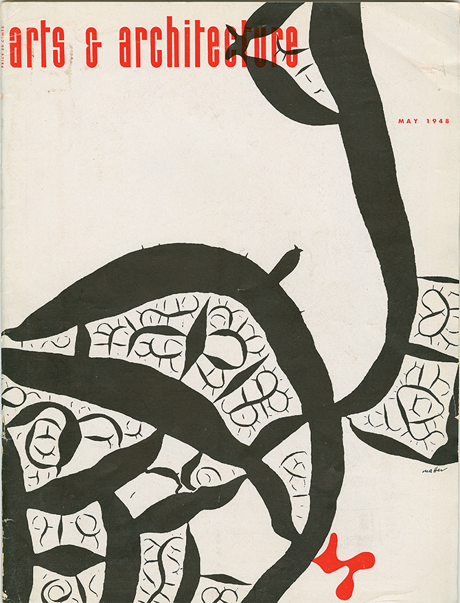
Herbert Matter (1907–1984) | Arts & Architecture cover, July 1945 and May 1948. Download a PDF of this page spread.
John Follis designed and illustrated many covers for the magazine, first, from 1942 to 1944, for art director Alvin Lustig, and then as art director himself. Follis’s covers display his bold yet refined sense of composition and his great sensitivity to form and color. The same sensibility marks the planters he created for Architectural Pottery, the operation he cofounded in 1950 and whose elegant modern forms became icons of California’s outdoor leisure lifestyle. Like his modernist colleagues, he believed good design could improve the world.
Follis was one of Lustig’s many former students who went on to shape the L.A. design scene, and these magazine covers only hint at the wide range of his talents and the types of projects to which he applied his gifts. Follis is credited as among the first to merge graphic-design principles with large-scale architecture, making him a pioneer in the establishment of the field of environmental graphics.
Along with other creators of A&A covers, Follis founded the Society of Contemporary Designers, an organization both ironic and serious that created a community of designers before the establishment of local professional organizations such as the Art Directors Club and the L.A. chapter of the American Institute of Graphic Arts (AIGA).

John Follis (1923–1994) | Arts & Architecture covers, 1950–57 Download a PDF of this page spread.
Frederick Usher did quite a few covers for Arts & Architecture, although this particular proposal was rejected. According to David Travers, who took over the magazine from founder John Entenza in 1962, the cover designs weren’t intended so much to echo the content of a given issue as to “stimulate newsstand sales.” And as Entenza explained, the publication’s ambition was to “present good contemporary design … to a largely lay audience and nudge its professional and architectural student subscribers toward a truer path.” Why this compelling design didn’t fit the bill remains a mystery.
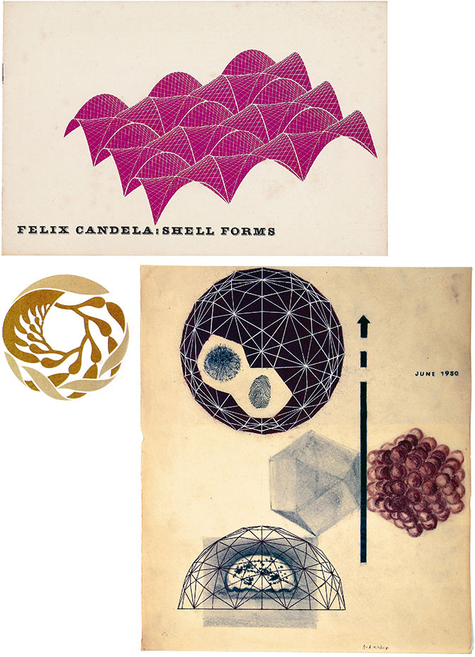
Frederick Usher (1923–2009) | Arts & Architecture cover sketch, 1950 Download a PDF of this page spread.
Ray Eames designed twenty-six covers for the magazine, some during its incarnation as California Arts & Architecture. This was the penultimate cover she conceived for Arts & Architecture; she It departs from her earlier covers, which featured more drawn or painted imagery, collage, biomorphic shapes, and/or combinations of these approaches, sometimes with the inclusion of hastily hand-drawn type. This one also marks the end of Ray’s solo graphic design work, before she turned her exclusive focus toward collaborations with Charles.
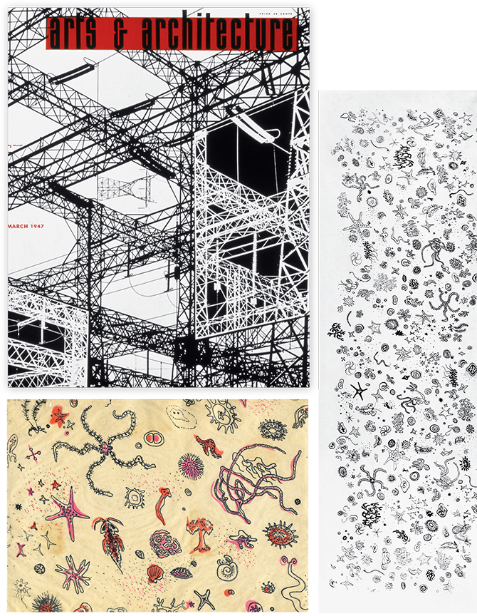
Ray Kaiser Eames (1912–1988) | Arts & Architecture cover, March 1947 Download a PDF of this page spread.

