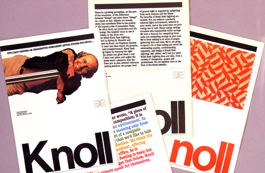
The Black Rule is intimately connected to a typographic grid, and the paper it’s printed on. It’s the sign of the hand of a graphic designer who shows no sign of his hand. It’s not really necessary, but it’s critical to the identity of the work and the person who imagined it. It’s an indulgence wielded by an unusually unindulgent designer.
The Black Rule rocks the tradition of black as a marker of importance and formality. Black letter, black leather, black lingerie, black marks, black tie, the black box, black robes, the black frame that turns white paper into an obituary: the depth of black takes each situation and makes it more so. It’s a western tradition, this gravity of black; so deep-seated as to be unmistakable, even when not specific to the message. At the very least, black says, “Pay Attention.” (…“and by the way, the paper ends here”).
Now why is that parenthetic comment of any interest? Because the other thing The Black Rule is, is an anachronism. This from a designer known for his attachment to an ideal of timelessness. (It just goes to show that you can’t control everything, as much as you might like to). The Black Rule defines the edge of the paper, the space of the page, the hierarchy of heads and subheads, stops and starts. The width and depth of The Black Rule is proportionate to the grid. The grid was a regular, mathematically simple, framework for the sizing and proportioning of text and images, often driven by the proportion of the photographs, divided by the spaces between paragraphs. One thought of the spaces and boundaries of the old-school grid as being quite physical, devoid of ambiguity and capriciousness. Back in the day when a young designer had to take a piece of coated illustration board and draw a grid with non-reproducing blue pencil upon it, to start the work of laying out a poster or a brochure or a book, when all that work had to be done before you even began what you really needed to do, the right grid would simplify the options and efficiently speed the job along. 
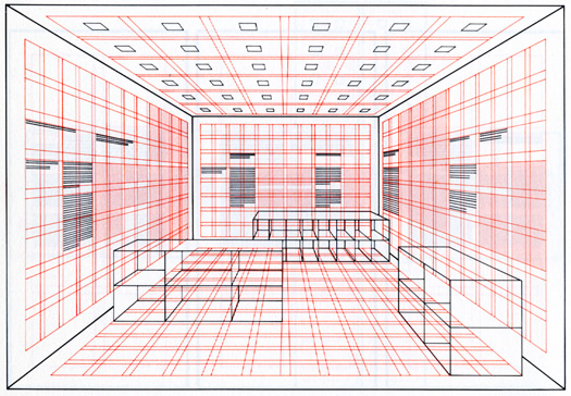
A digression is in order, here. There is a famous diagram by an august Swiss proponent of the grid that shows a typographic grid extended into a three-dimensional space: it’s just a room, but it might as well be stretching into infinity. If you saw the movie Tron, the one that sort of tried to visualize what William Gibson might have meant by cyberspace, it didn’t look that different from Josef Müller-Brockmann’s giant fishing-net of gridspace stretched like Lycra across all (Day-Glo and black) reality. But it turns out that there is no edge to cyberspace, not on a screen and not out there in the giant networked whatever. Only that which is solid has an edge: a wall, a building, a piece of paper. So the physicality of The Black Rule is an analogue of the finite, architecture reduced to two dimensions, connecting the structure of the grid to the field that it is defining (and it is definite); it has a beginning, points along the way that need support, and an end. So another way of looking at The Black Rule is to not see it as superfluous at all, but as important to a poster as a 2 x 4 might be to holding up a tract house. You can’t just saw it off and expect things to stand up. Because the grid without some sort of dynamic support is just a (theoretically endless) field of options, and The Black Rule provides a decisiveness that turns out to be quite affective, and obviously fetching.

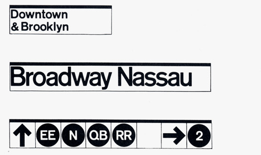
Any text looks fine knocked out of The Black Rule: “Lexington Avenue” knocked out in Helvetica, hung from a grubby subway ceiling; “Joshua Tree National Park” knocked out in Helvetica, edging the top of a folded U.S. Park Service map; any number of words set in Bodoni, or Garamond #3, or Century Extended, hanging below The Black Rule. Another thing about The Black Rule is that it is democratic: though its formality emanates from the power of Black, and its authority emanates from its connection to the grid, it sits just as happily on a piece of non-profit newsprint, or matte-coated paper, or powder-coated steel, or 100 percent rag stationery. No snobbery connects to The Black Rule.
So The Black Rule is definitive, of space and the designer who wields it. One cannot help but admire a gesture so all-purpose, so ordinary, so formally effective yet totally unusable by anyone else than Massimo Vignelli. And this, finally, is the other anachronistic oddity of The Black Rule. Vignelli discovered and claimed it for his own at a time when design moved more slowly: when designers had time to mark their own work, when individual gestures did not circulate at the speed of light, independent of their sources. And though the word brand was never used back in that day, The Black Rule surely performed that function for Vignelli, along with all the other tasks it was assigned. By the time other designers recognized it for what it was, it had been utilized, in all of its faux simplicity, simply too often for anyone else to adopt it without feeling as though they were stealing something (or at least being terribly unimaginative). Inversely, clients were more than happy to flaunt The (same) Black Rule, as a sign that they had joined the club, subjected themselves to the process of working with the Vignelli Office: The Black Rule as badge of (well-earned) allegiance. In the end, The Black Rule belonged to everyone, except some other designer (unless they were willing to play the sticky post-modern wicket [and….cue Massimo, chuckling in the background]). It is so impossibly hard to think of any designer owning a thing like The Black Rule the way Massimo Vignelli owned it. Time, and space, and grids, and graphic design in control: none of these work in quite the same way, anymore.


Comments [5]
Even so, I cannot help but notice that it does appear rather prominently at the top of this web site!
09.14.10
04:46
It's a great week to be tuning into Design Observer... I'm loving these articles!
09.14.10
07:07
09.15.10
01:22
09.15.10
05:04
The black bracket as originally specified would have created the same effect as a black rule (albeit with a little more functional integrity). So the intention was really the same.
09.16.10
12:13